Pie Chart
Use the Pie Chart widget in NocoDB dashboards to show how data is distributed across categories. It is good for showing how segments make up a whole.
Copy a prompt, paste it into NocoAI in any base, and replace the words in [brackets] with your own.
- Add a pie chart of [tickets] by [Priority]
- Add a pie chart of [records] by [Status]
- Change the [widget name] chart to show only [open] records
Title & Description
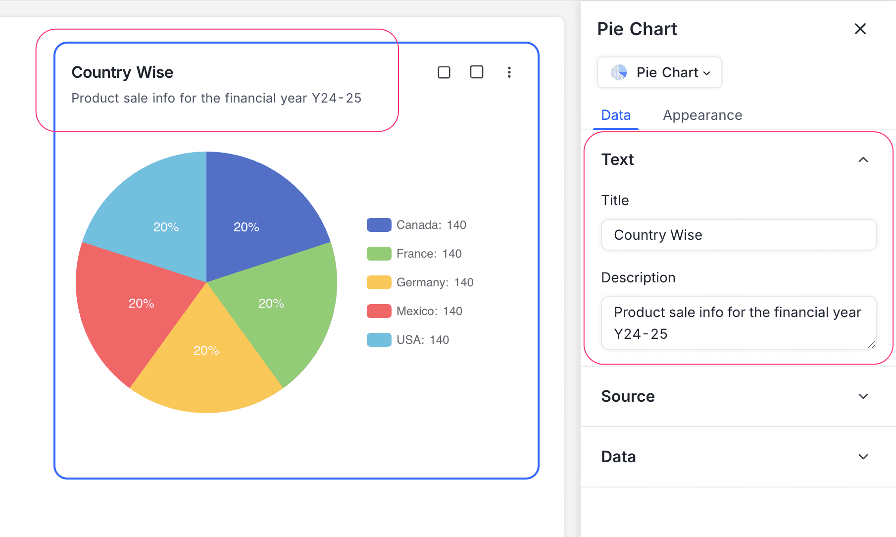
- Title: Enter a title for the pie chart widget. The title shows at the top of the widget.
- Description: Optional. Add a description that gives context or details about the data. The description shows below the title.
Data Source
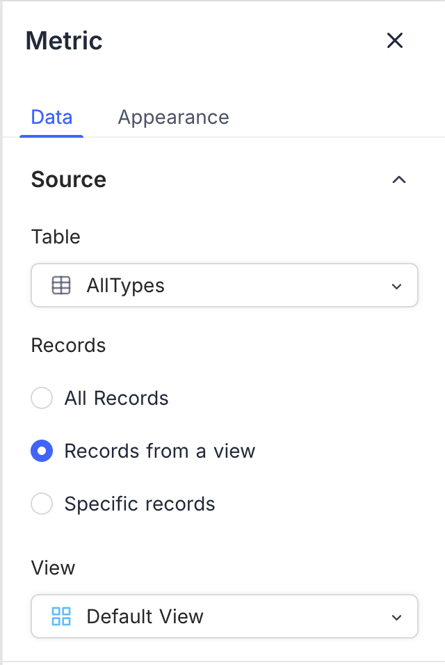
- Table: Select the table that supplies the data for the pie chart. This table is the main source of records for the chart.
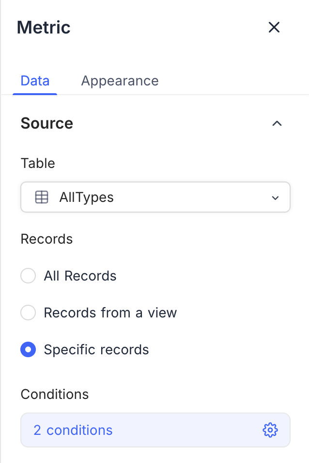
- Record: Select the records from the table to include in the pie chart. The options are:
- All Records: Shows all records in the selected table.
- Records from a view: Filters the records with a specific view, for a more focused chart. Select a view from the list.
- Specific Records: Uses filters to select specific records for the pie chart. Use it to show data that meets some criteria. You can add more than one filter to narrow the selection.
Display
-
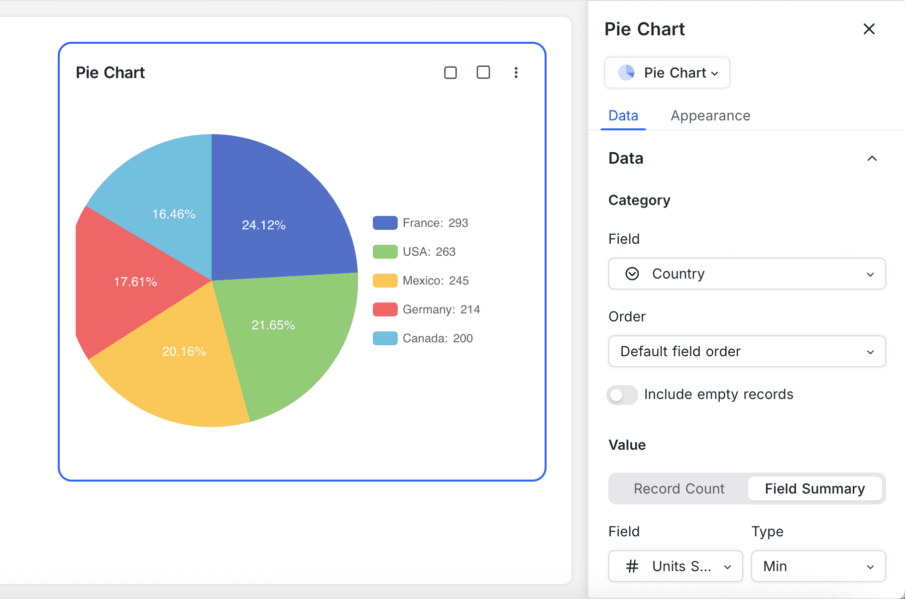
Category Field: Select the field that sets the segments of the pie chart. This field must contain the categories that you want to show.
-
Order: Select the order of the segments in the pie chart:
- Default: Shows the segments in the order of the data.
- Ascending: Sorts the segments by value, in ascending order.
- Descending: Sorts the segments by value, in descending order.
-
Include empty records: Optional. Includes records that have no value in the category field. Without this option, the chart can omit segments because of missing data.
-
-
Value Field: Select the field that sets the size of each segment in the pie chart. This field must contain numbers that give the value for each category.
- Record Count: Shows the number of records in each category.
- Field Summary: Shows the sum, average, minimum, maximum, or count of a specific field across the selected records. The options change with the field type.
Appearance
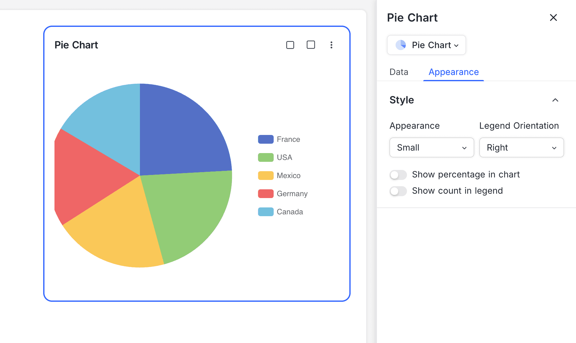
You can change the look of the pie chart to make it clearer. These options are available:
-
Size: Set the size of the pie chart to fit your dashboard layout. Select small or medium.
-
Legend Orientation: Select the position of the legend. The legend shows the category names and their colors.
Option Legend position Right To the right of the pie chart Bottom Below the pie chart Left To the left of the pie chart Top Above the pie chart -
Show Percentage in chart: Shows the percentage of each segment in the pie chart. This helps you understand the data distribution.
-
Show Count in Legend: Shows the number of records for each category in the legend. This tells you how many records each segment has.
Last updated on