Line Chart
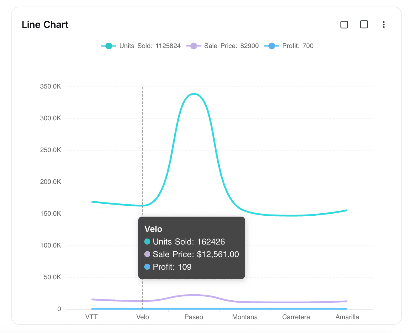
Use the Line Chart widget in NocoDB dashboards to show trends and comparisons across categories or time. It is good for tracking changes, finding patterns, and comparing many metrics at the same time.
Ask NocoAI
Copy a prompt, paste it into NocoAI in any base, and replace the words in [brackets] with your own.
- Add a line chart of [new signups] per [week]
- Add a line chart of [revenue] by [month] for this year
- Change the [widget name] chart to group by [day]
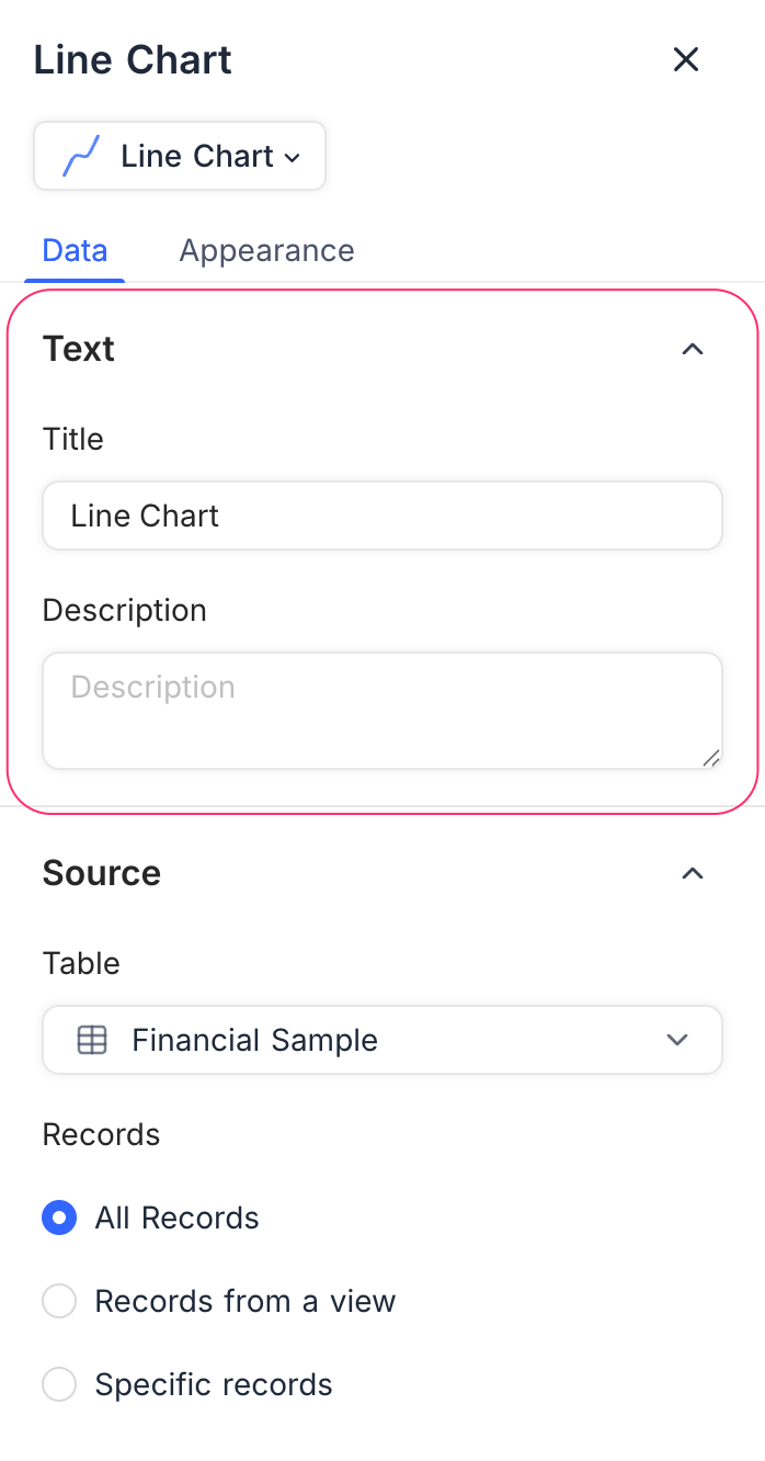
Title & Description
- Title: Enter a title for the line chart widget. The title shows at the top of the widget.
- Description: Optional. Add a description that gives context or details about the data. The description shows below the title.
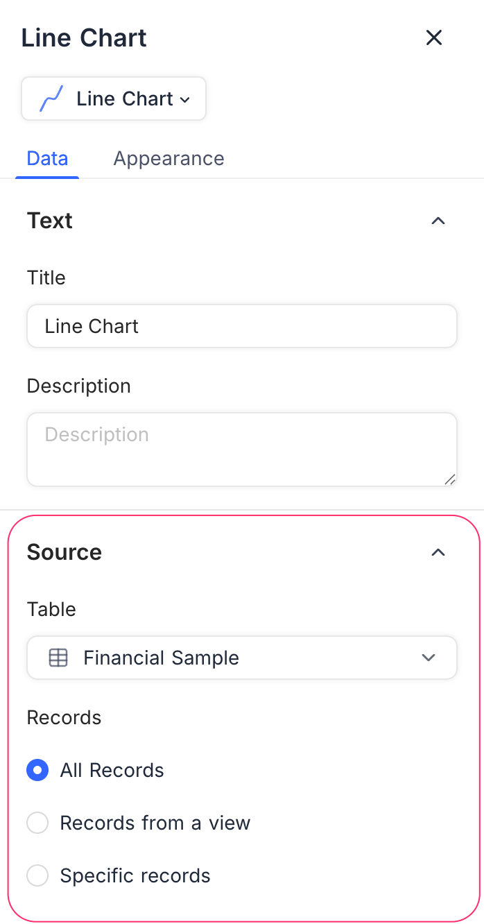
Data Source
- Table: Select the table that supplies the data for the line chart.
- Records: Select the records to include:
- All Records: Shows all records from the selected table.
- Records from a view: Uses the records of a specific view. The filters and sorts of the view apply.
- Specific Records: Uses custom filters to select only some records.
Display
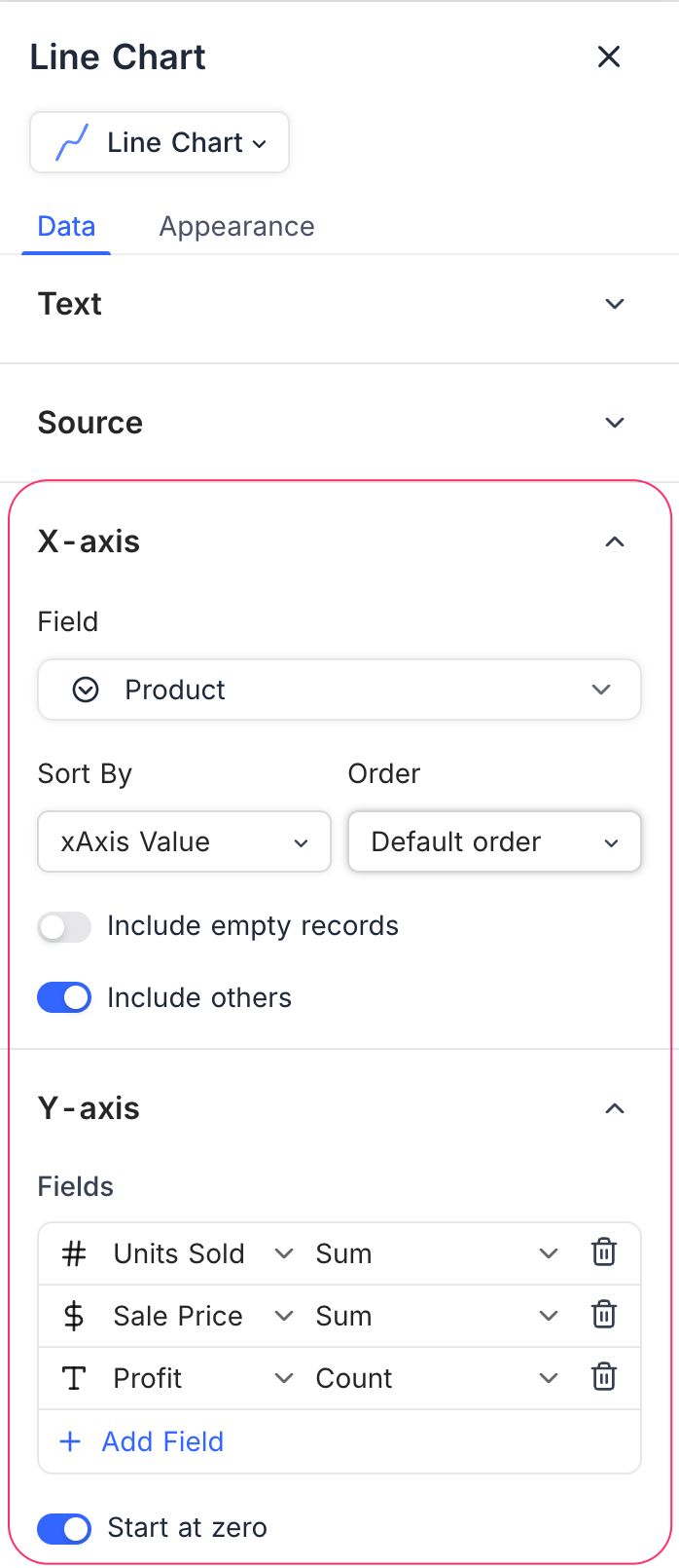
X-axis
- Field: Select the field whose values show along the X-axis (for example, Date, Product, Category).
- Sort By: Select how to sort the categories:
- xAxis Value: Sorts by the label values.
- yAxis Value: Sorts by the numeric values in the chart.
- Order: Select Default, Ascending, or Descending.
- Include empty records: Optional. Includes categories that have no values.
- Include others: Puts smaller categories into one “Others” group.
Y-axis
- Fields: Select one or more fields to show on the Y-axis. Each field shows as one line in the chart.
- Record Count: Shows the number of records for each category.
- Field Summary: Shows the Sum, Average, Min, or Max of a numeric field.
- Start at zero: Makes the Y-axis always start at zero, for consistency.
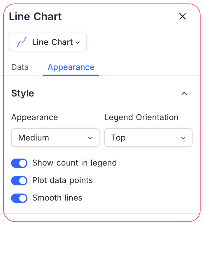
Appearance
Change how the chart shows, to make it clear and easy to read:
- Size: Set the chart size (Small, Medium).
- Legend Orientation: Select the position of the legend (Top, Bottom, Left, Right).
- Show count in legend: Shows the record counts in the legend.
- Plot data points: Highlights the data points on the line.
- Smooth lines: Shows smooth curves, not jagged lines.
Last updated on
Latest product updates?See Changelog