Table
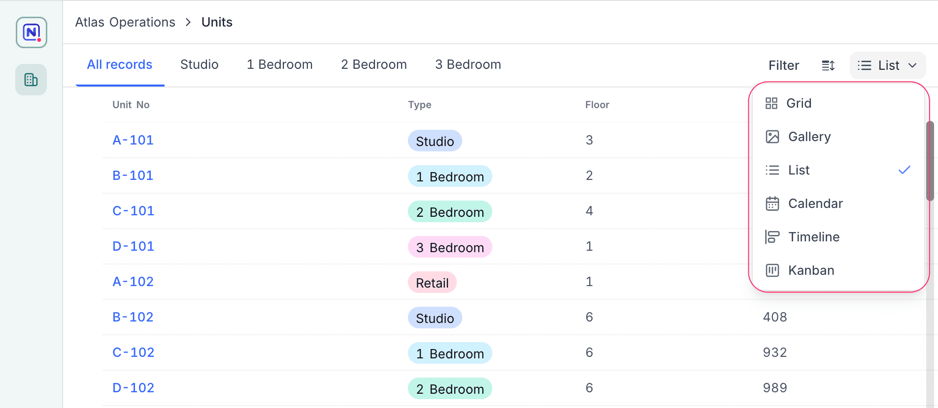
A Table page connects to a table and shows its records in one or more visualizations. Add several visualizations to give users different views of the same data. When a page has more than one visualization, users can change between them with a switcher.
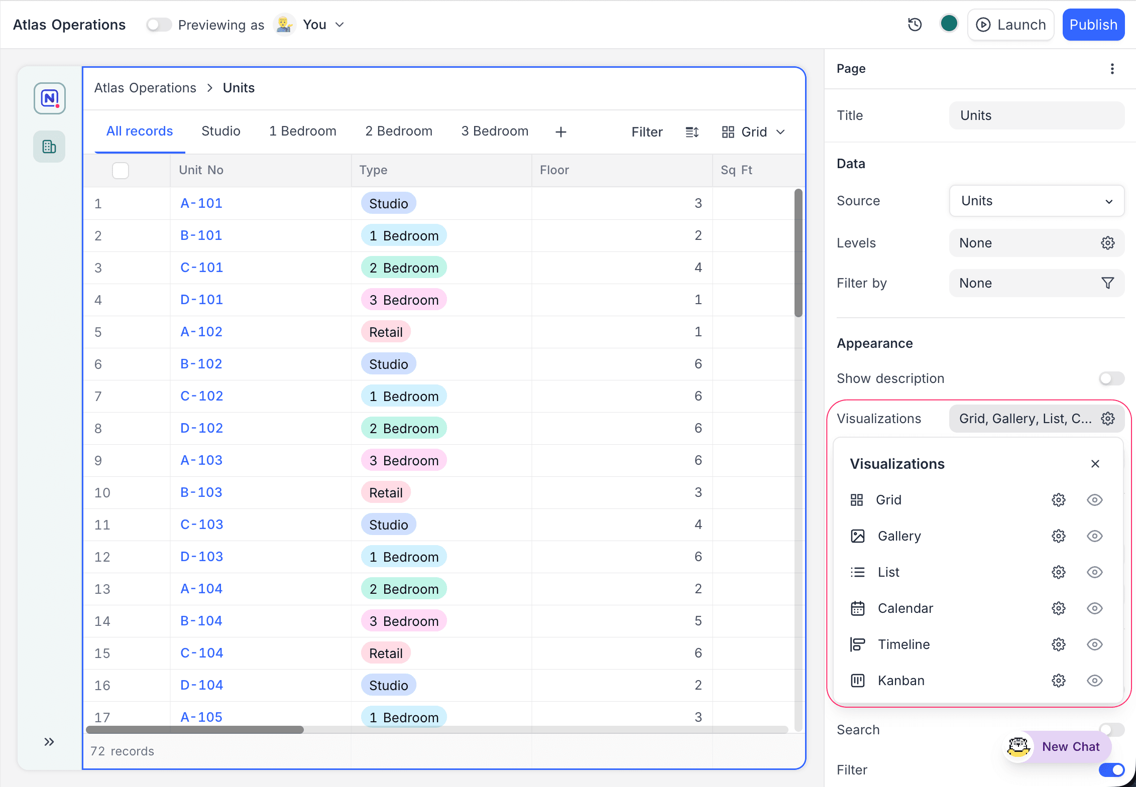
Common settings
These settings are available for all visualizations on a table page:
| Setting | Description |
|---|---|
| Filters | Limit the records that the visualization shows. Visualization filters combine with page-level filters. |
| Sorts | Set the record order. |
| Visible fields | Select the fields that show, and their order. |
| Colour records by | Color records based on the value of a field. |
| Click into details | Open a record detail page when a user clicks a record, as a modal or side sheet. |
| Inline editing | Let users edit field values directly in the visualization. |
| Add / delete records | Let users create and delete records from the page. |
| Add record through form | Send the add-record button of the page to a reusable form page, not to an inline row. When you turn it on, NocoDB connects the button to the first available form for the table. You can then change the form. If the table has no form page, the button has no form until you select one. |
The page header can also have buttons. These buttons open a record creation form, go to a page or external URL, or run an automation.
Visualizations
Each visualization has its own settings. You edit them in the properties panel of the builder.
Grid
Grid shows data in a spreadsheet-style table. Use Grid when users must scan many fields at the same time. For example: operations trackers, content pipelines or a page that is also a simple data-entry surface.
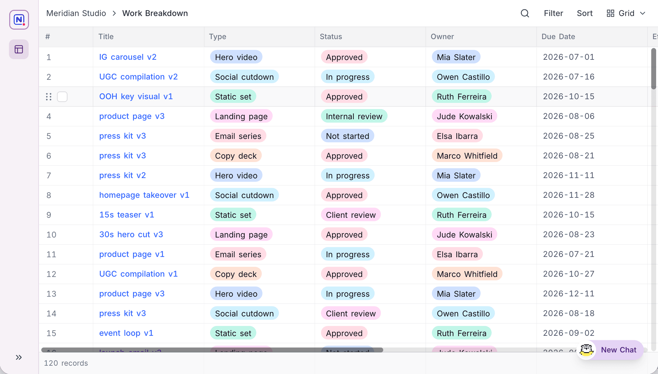
To change the reading density, set Row height (Small, Medium, Large or Extra large). To show the description of each field in its column header, turn on Show field descriptions.
Group by puts records under headers that you can collapse:
- To add up to three levels, use New Subgroup.
- To change the order of levels, drag them.
- Set a direction for each level: ascending or descending by value, or by record count. Count (9 → 1) and Count (1 → 9) are available on Grid only.
- To remove the uncategorized group, turn on Hide empty groups.
Summaries let you select an aggregation for each column. The aggregation shows in the grid footer and in each group header. NocoDB saves your selections with the visualization. They stay after a reload and also apply in the published interface.
When Add / delete records is on, you can delete many records at the same time:
- Select all records with the header checkbox.
- Right-click. The menu shows Delete all records. If you cleared the selection of some rows, it shows Delete all selected records.
The delete applies to the records that remain after the page filters and the current search of the user. It is not available on a grouped grid or on synced tables.
Gallery
Gallery shows records as visual cards, with an image first. Use Gallery when the image is the most important part. For example: portfolios, product catalogs, asset libraries or property listings.
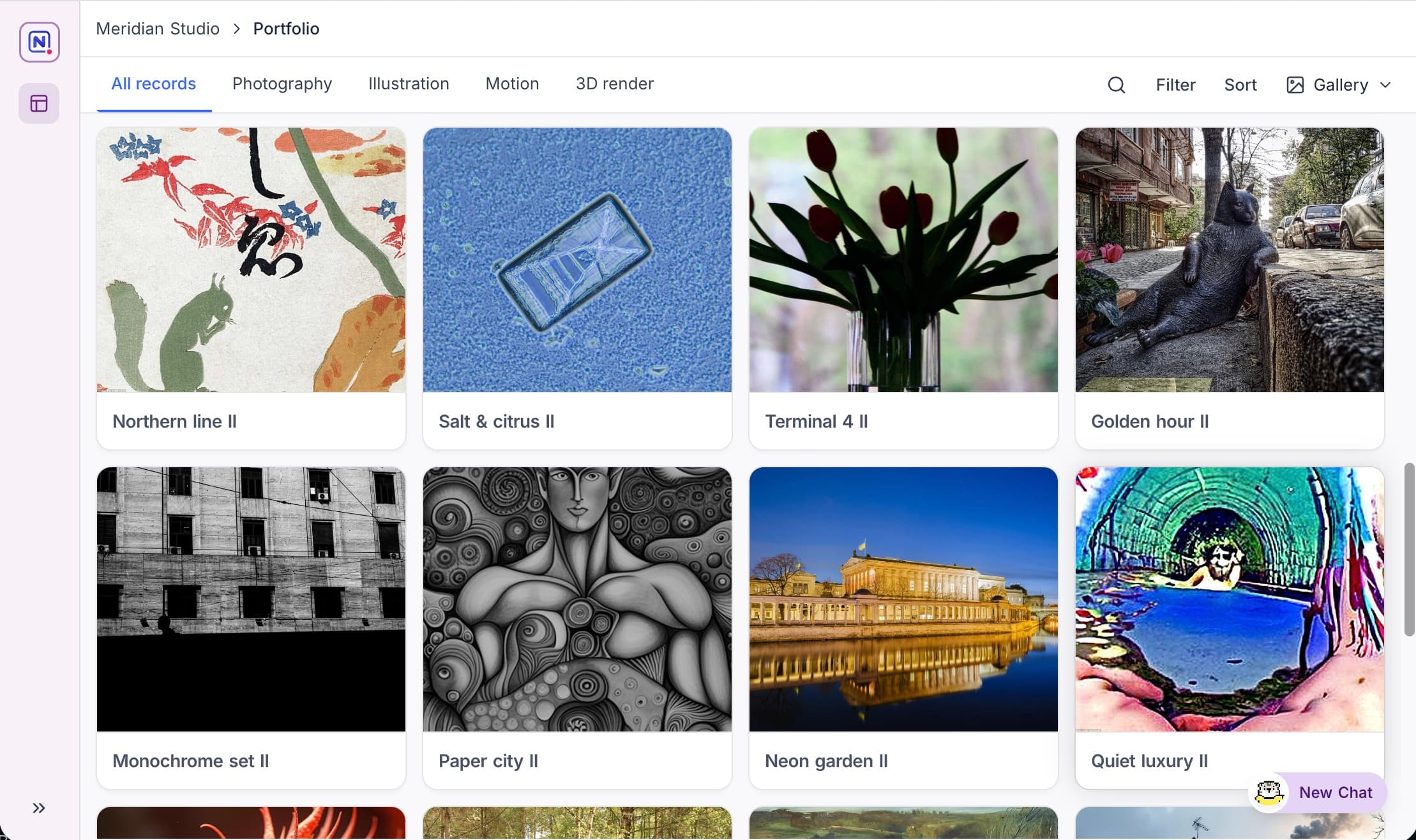
The card cover comes from an Image field. Two settings control its shape:
- Aspect ratio: None, Wide, Square or Tall.
- Cover: sets if the photo fills the frame or fits in it.
Select a Theme to set the general appearance:
| Theme | Appearance |
|---|---|
| Card | Cover on top, details below. |
| Poster | The image fills the card, with the title on top of it. |
| Minimal | Image only. |
| Simple | The title, and one Secondary field that shows when you put the pointer on the card. |
Card and Poster also have a Style (Rich or Compact) and a Title field with its size for the caption below each cover.
Cards per row is Auto by default. Auto changes with the available width. You can also set a fixed value from 1 to 6 for a strict grid. To keep cards clean, set these options:
- display field names: show field names next to values.
- hide empty fields on cards: hide empty fields so that they do not leave gaps.
Kanban
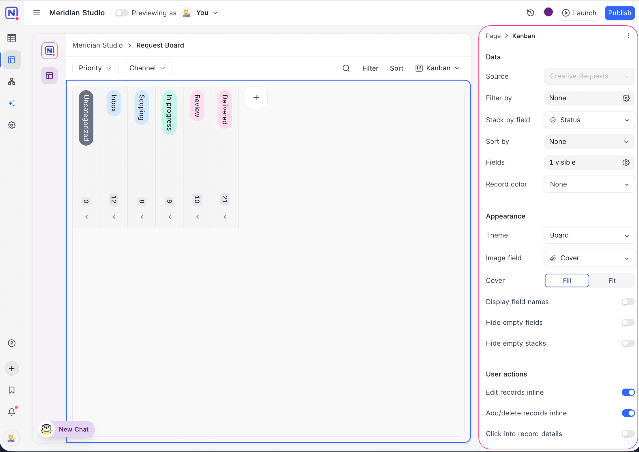
Kanban shows records as cards in columns. There is one column for each value of a single-select field. Use Kanban for items that move through stages. For example: request triage, content production, hiring or a sales pipeline.
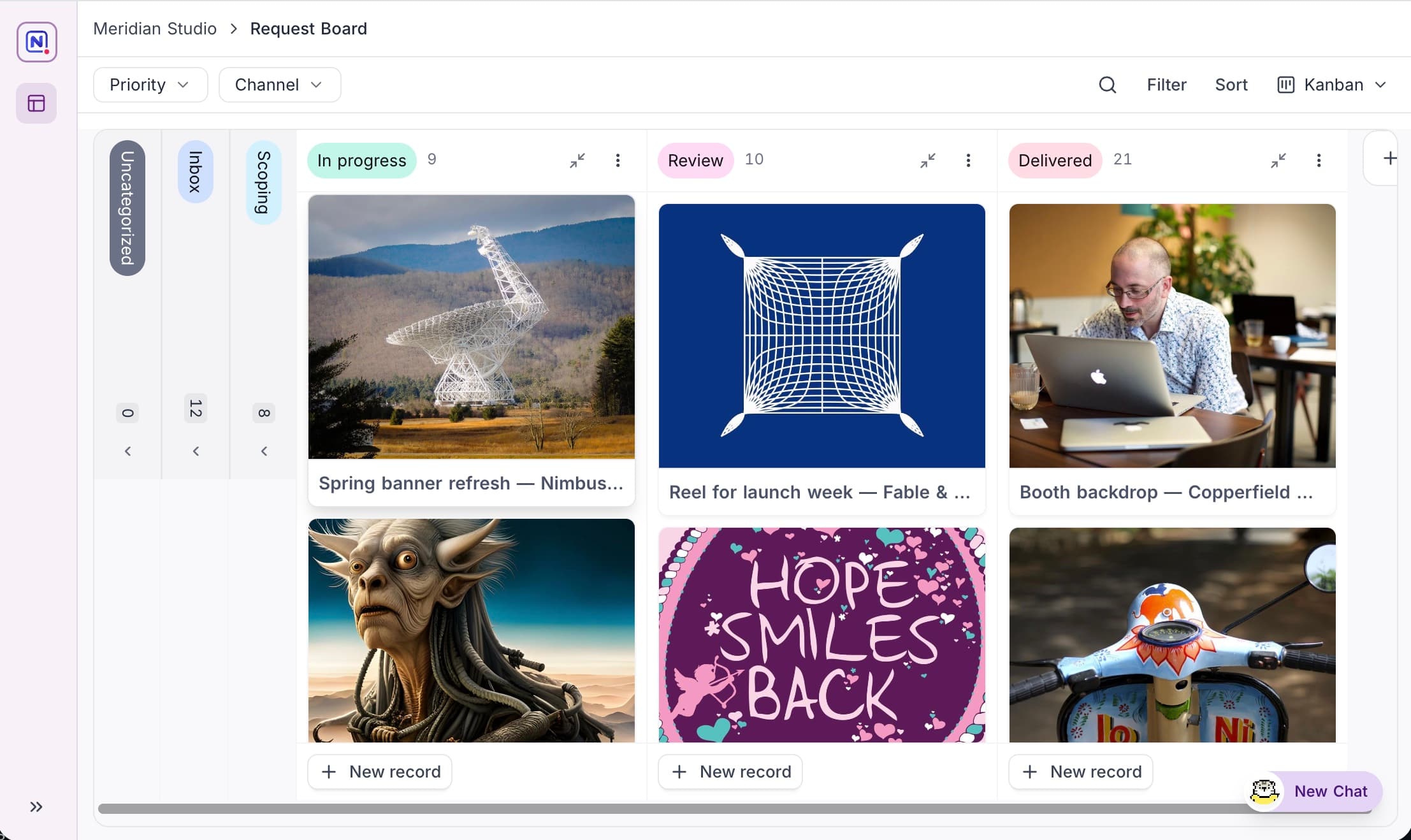
Stacked by (required) sets the single-select field for the stacks. Each option becomes a column. An Uncategorized stack holds records that have no value. When the visualization allows inline editing, users can drag a card to a different stack to update that field. To keep wide boards manageable, users can collapse stacks to narrow pills.
| Setting | What it does |
|---|---|
| Theme | Sets the appearance: Board, Columns, Tint or Compact. |
| Image field | Gives cards a cover, with a fit image control. |
| Hide empty stacks | Removes columns that have no records. |
| display field names | Sets if cards show labels for their values. |
List
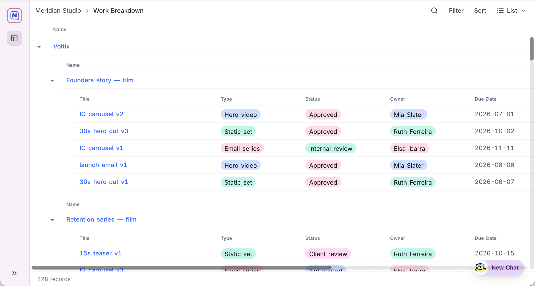
List shows records as a compact list. Optionally, Levels make the list an outline with more than one level. Use List when records need the context of their parent. For example: deliverables under campaigns under brands, tasks under projects or line items under orders. A footer shows the total record count.
| Setting | What it does |
|---|---|
| Prefix field | Shows a field before the title of each row. |
| row height and wrap headers | Control density. With wrap headers, headers wrap and are not truncated. |
| Group by | Puts records under headers that you can collapse. |
| show field descriptions | Shows field descriptions in column headers. |
| collapse all by default | Collapses all sections at the start. The viewer expands them. |
Levels
Levels put records below their parent records with link fields. The list then becomes an outline. You configure levels from the innermost record outward. The first level is the source table of the page. Each level that you add above it is a parent table, connected through a link field.
The add-level menu shows the tables that already link to the outermost level. Under Other tables, it shows the tables in the same source that do not link to it. When you select one of those tables, NocoDB creates the link field and adds the level in one step.
You configure each level separately:
| Setting | What it does |
|---|---|
| fields | Sets the fields that the level shows. |
| sort | Sets the order of records in the level. |
| filters | Sets which records the level includes. |
| label | Sets the caption of the sections of the level. The default is the title of the link field. |
| click into record details | Gives the level its own record detail page. For example, a click on a campaign and a click on a deliverable can open different detail pages. |
The innermost level can also nest records from its own table. Use this for hierarchies like tasks with subtasks, or reporting lines:
- Turn on Enable nested records.
- Under Nest by, select a link field that points back to the same table. Each record then expands in place to show its children.
If the table does not have such a link, click Create a linked record field to create one in place.
Hide empty sections is a separate setting. It removes parent sections that have no records below them.
Levels are part of the List visualization. When a page has a List visualization, you can also open Levels from the Data section of the page.
Working with records
When the editing options of the visualization allow it, users can edit cells inline. To start editing, users can type directly into a cell.
+ New record adds a row inline:
- In a flat list, at the end of the list.
- In a list with levels, in the innermost section. NocoDB links the new record to its parent automatically.
If you add a record at a parent level, or inline adding is off, the create form of the page opens.
Calendar
Calendar shows records on a calendar, based on date fields. Use it for dated items that people plan around. For example: content calendars, editorial schedules, bookings or delivery dates.
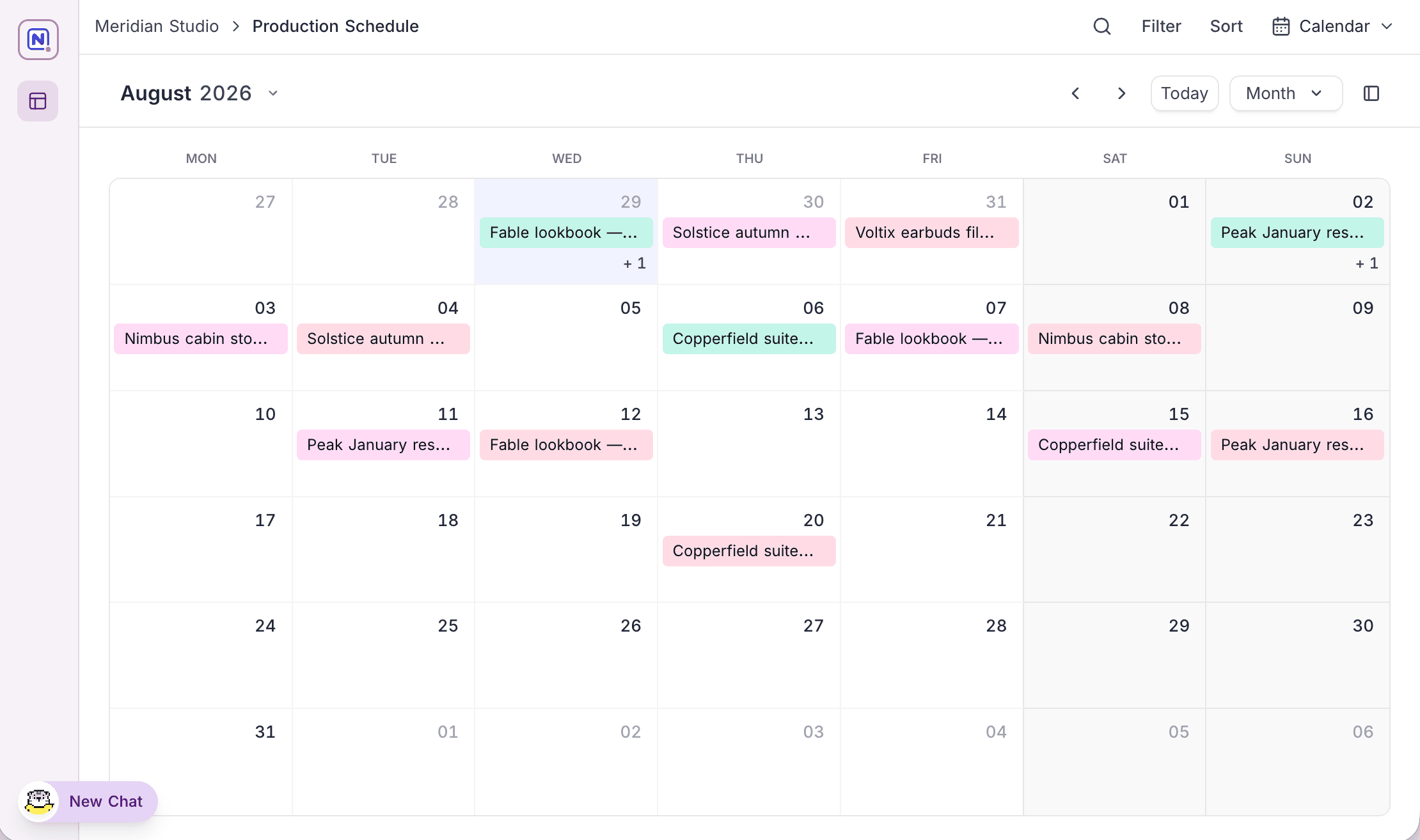
Date range sets the start date field, and optionally the end date field. With an end date, records that last many days span across those days. The Label fields that you select label each event. Each label field can be bold, italic or underlined. An optional label image field adds a thumbnail to the event.
The Event display theme (Bordered, Dot, Solid, Minimal or Pill) sets how events show on the month grid. The Initial view sets what viewers see first: the default position, timescale, date row height and if weekends show.
Timeline
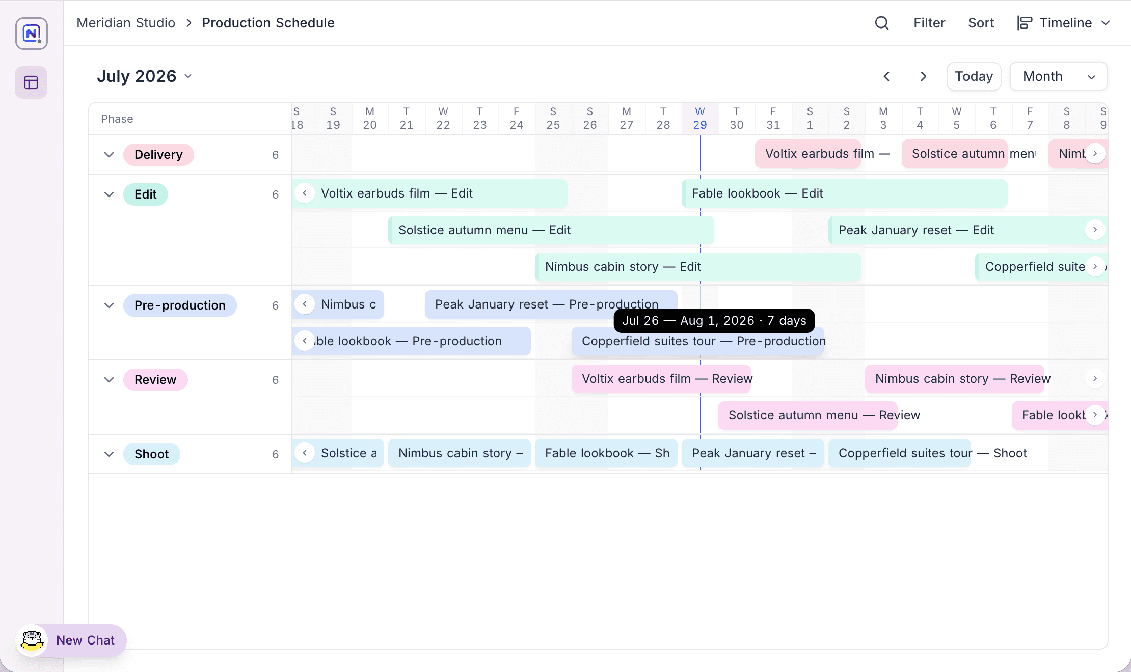
Timeline shows records as horizontal bars along a time axis. Overlaps, gaps and durations are easy to see. Use Timeline for schedules where the duration is as important as the date. For example: production phases, campaign plans, resource allocation or roadmaps.
| Setting | What it does |
|---|---|
| Date range | Sets the start and end date fields that give each bar its span. |
| Label fields | Sets the labels on the bars, with a wrap labels option. |
| row height and Record width | Adjust the layout. Record width fills the timescale or uses a fixed width. |
| Group by | Splits bars into swimlanes, for example one lane for each phase or each assignee. |
| Initial view | Sets the starting timescale, from day up to year. |
Summarize calculates a value along the time axis. The value shows below each visible time column in a bottom bar. When the visualization is grouped, it also shows for each group. Select a function (Count, Sum, Avg, Min, Max, Range or Median) and the field to calculate. You can summarize only fields that are visible on the visualization.
Summarize is available on Timeline visualizations whose data source is PostgreSQL, and only while dependencies are off. When you turn on Show dependencies, the visualization changes to Gantt, where Summarize is not available. It works the same way as Summarize on the Timeline view.
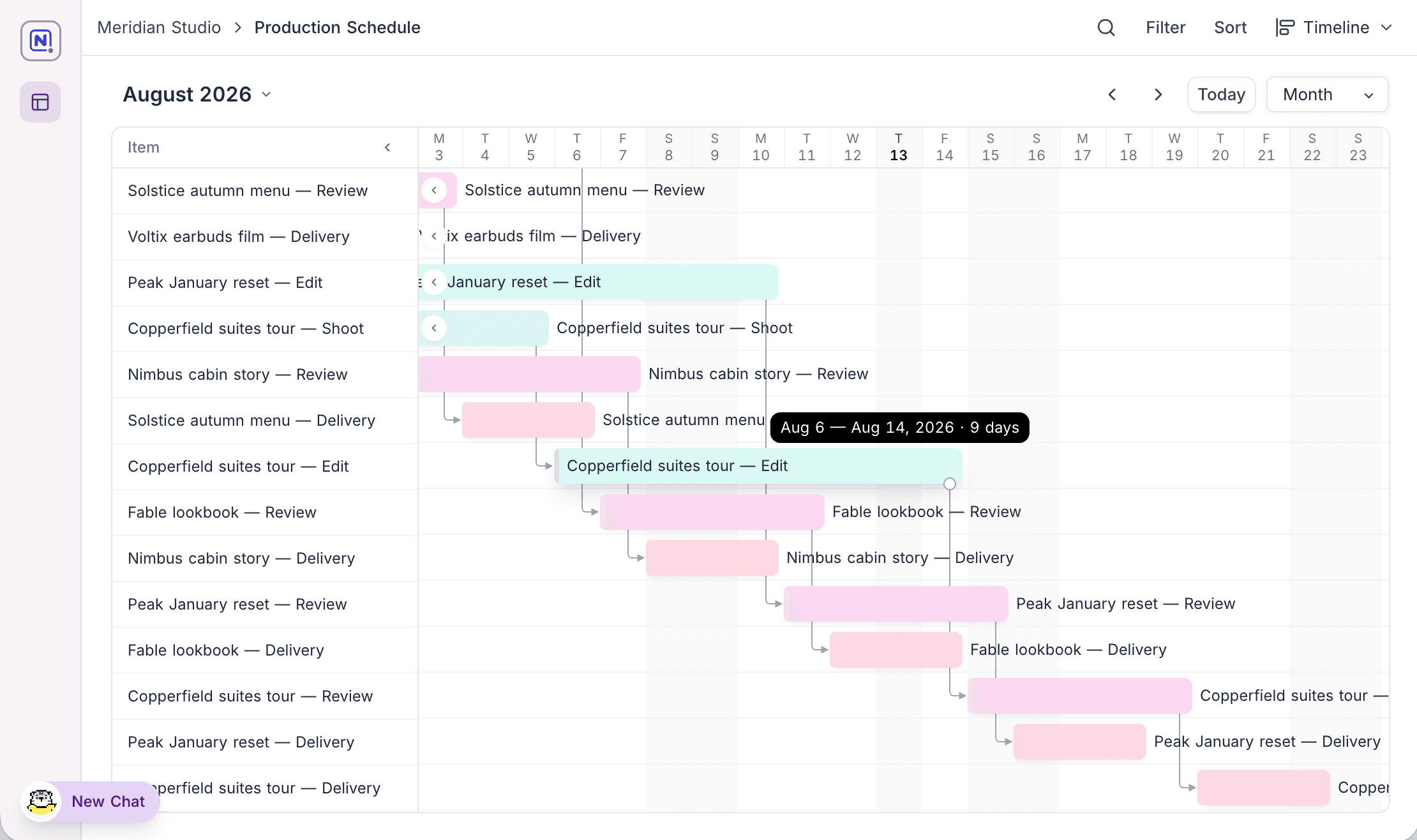
Show dependencies shows dependency arrows between linked records. The timeline becomes a Gantt-style chart. The arrows follow the date dependency rule of the table. This rule links each record to its successors through a link field. Thus, finish-to-start chains show as a waterfall.
Peek cards
On Calendar and Timeline, a click on a record opens a peek card with its details. The card shows if Click into details is on or off. When it is off, the card does not show the expand control. If the visualization allows users to add and delete records inline, the card also shows Duplicate and Delete.
Switching visualizations
Users change between the visualizations of the page with the switcher at the top of the page. You can also let a tab filter open a specific visualization for each tab. For example, a "Board" tab shows Kanban and a "Schedule" tab shows Timeline.
Last updated on