Gantt
Learn how to work with Gantt view in NocoDB.
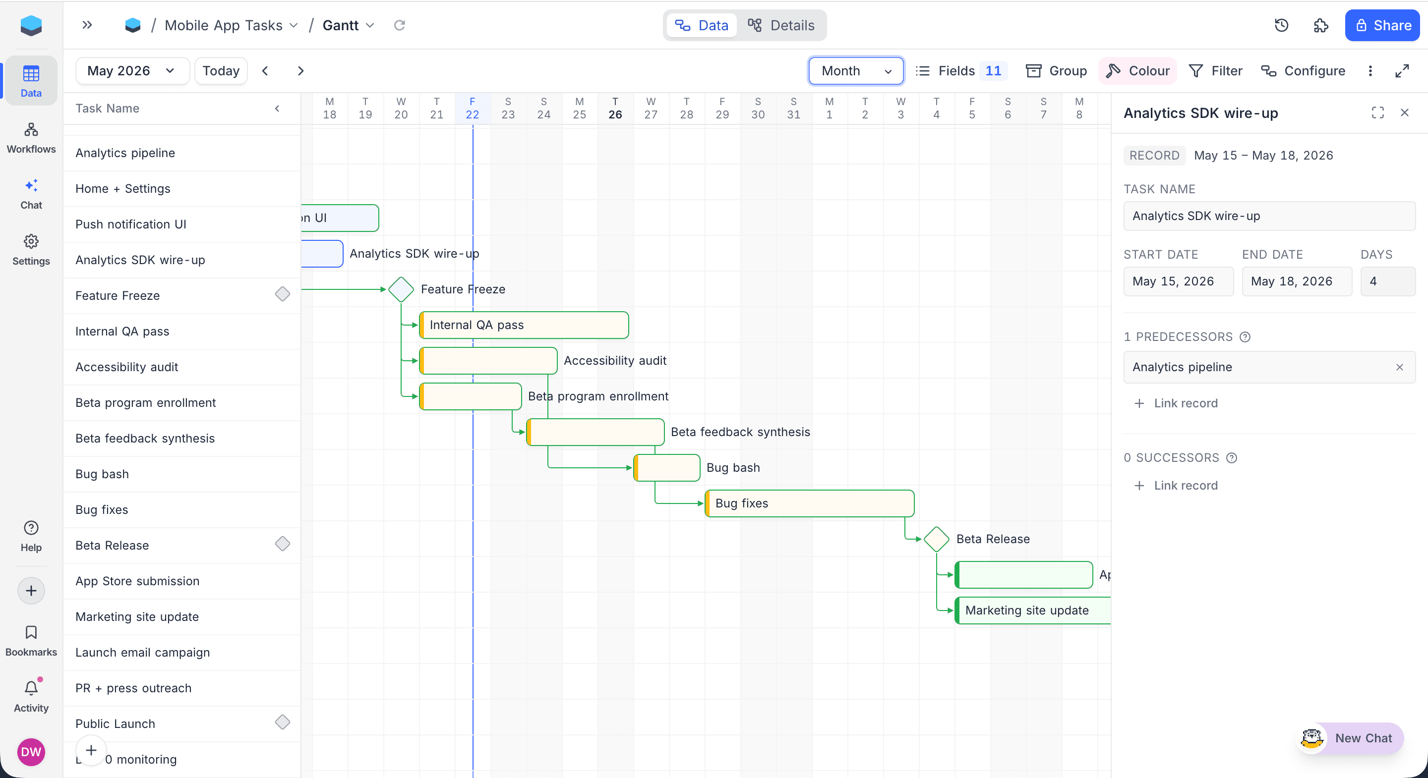
Plan sprints, track roadmaps, and manage dependencies. All from the same table you already use. Gantt View turns any date-based table into a live project schedule, where records become draggable bars on a timeline, dependencies become arrows between them, and key dates become milestone diamonds.
Drag to reschedule, resize to extend, and pull from a bar's handle to link tasks together. Zoom from a one-week sprint all the way out to a five-year roadmap without changing views.
This section covers everything you can do in the Gantt view.
Gantt View Actions
- Create a New Gantt View
- Rename an Existing Gantt View
- Duplicate a Gantt View
- Remove a Gantt View
- Share a Gantt View
- Lock Gantt View for Edits
Configure Gantt Schedule
Gantt View renders bars and arrows from a per-view Date Dependencies rule. When a Gantt view is first opened, the Configure Gantt Schedule dialog opens automatically so you can pick the fields that drive the chart.
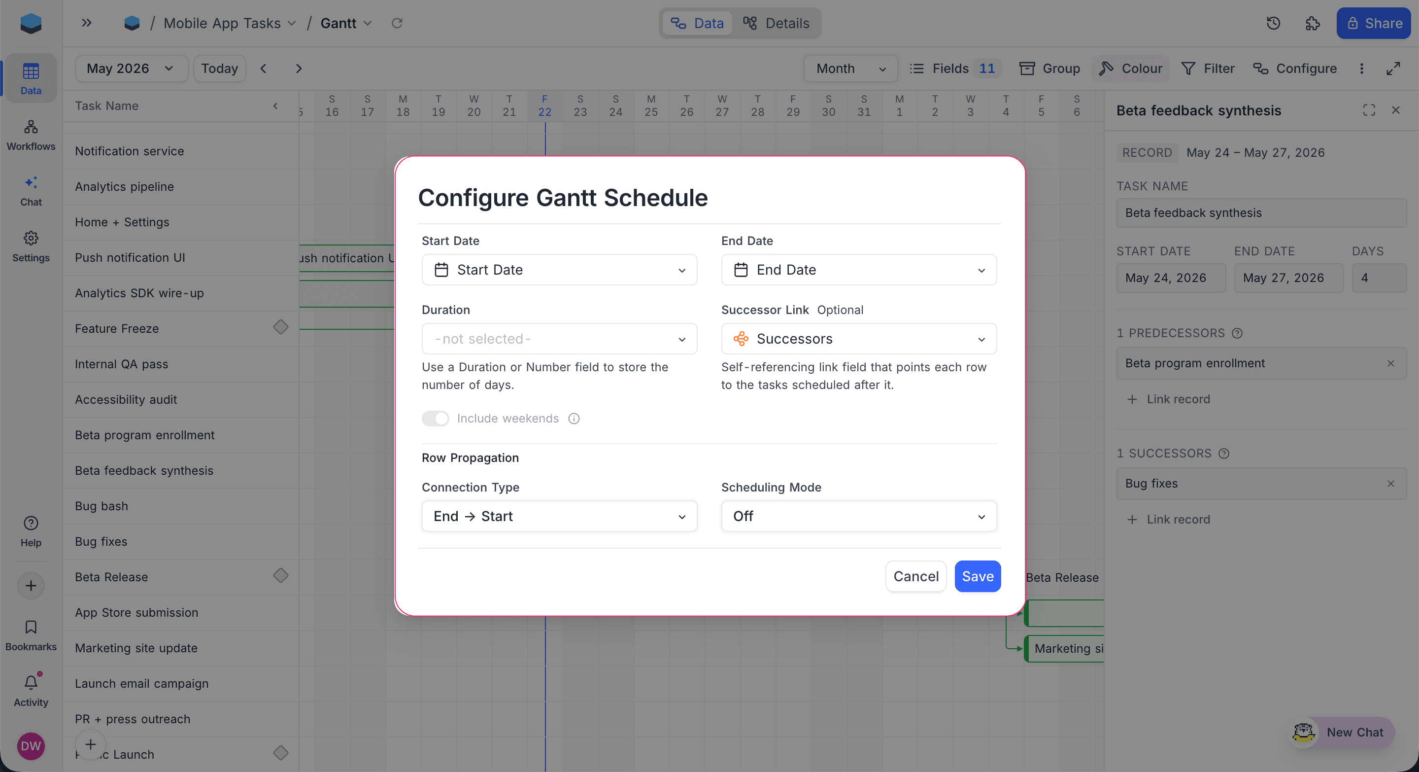
The dialog accepts the following fields:
| Field | Required | Purpose |
|---|---|---|
| Start Date | Yes | The Date field used as each record's bar start. |
| End Date | Yes | The Date field used as each record's bar end. Records without a start render as milestones at this date. |
| Duration | Optional | Number or Duration field. When set, edits to dates write back into this field, and edits to duration shift the End Date. |
| Successor Link | Optional | Self-referencing Links field that points each record to the tasks scheduled after it. Drives the dependency arrows on the chart. Must be Has-Many, One-to-Many, or One-to-One pointing back to the same table. |
| Include weekends | Toggle | When off, weekends (Sat/Sun) are skipped in all date calculations. Only takes effect when Duration, Scheduling Mode, or Buffer Days is configured — until then the toggle is disabled. |
When a Successor Link is selected, an additional Propagation section appears (PostgreSQL and MySQL bases only) for configuring how date changes cascade across linked records:
- Connection Type:
End-to-Start(default),End-to-End,Start-to-Start, orStart-to-End. - Scheduling Mode:
Off(no cascade),Flexible, orFixed. - Buffer Days: Number of days between a predecessor and its successor when cascading.
To reopen the dialog later, click Configure in the toolbar.

Empty state
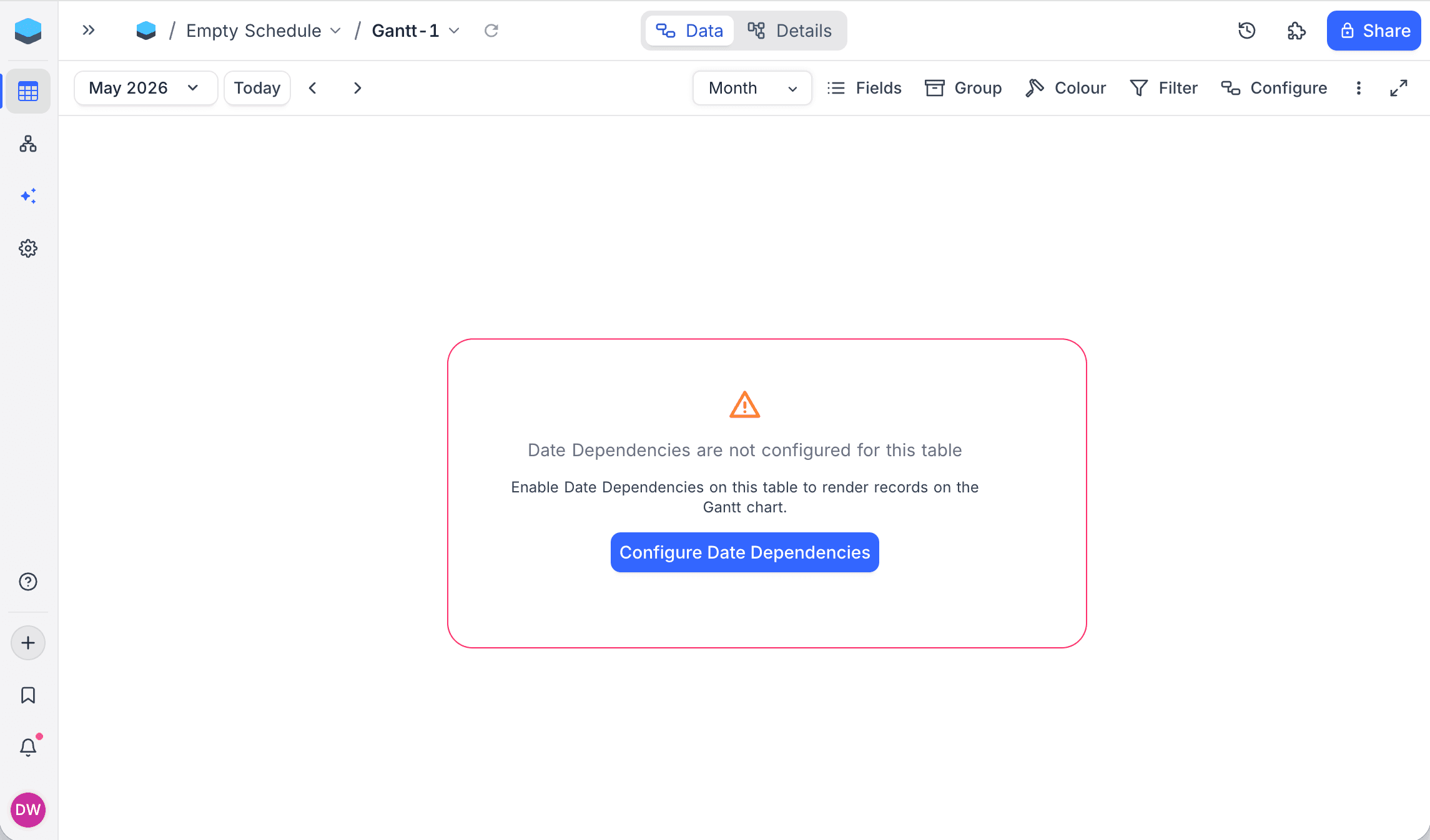
If the rule has not been configured (or its Start / End Date fields have been deleted), Gantt View shows an empty state with a Configure Date Dependencies button that opens the same dialog.
Zoom Levels
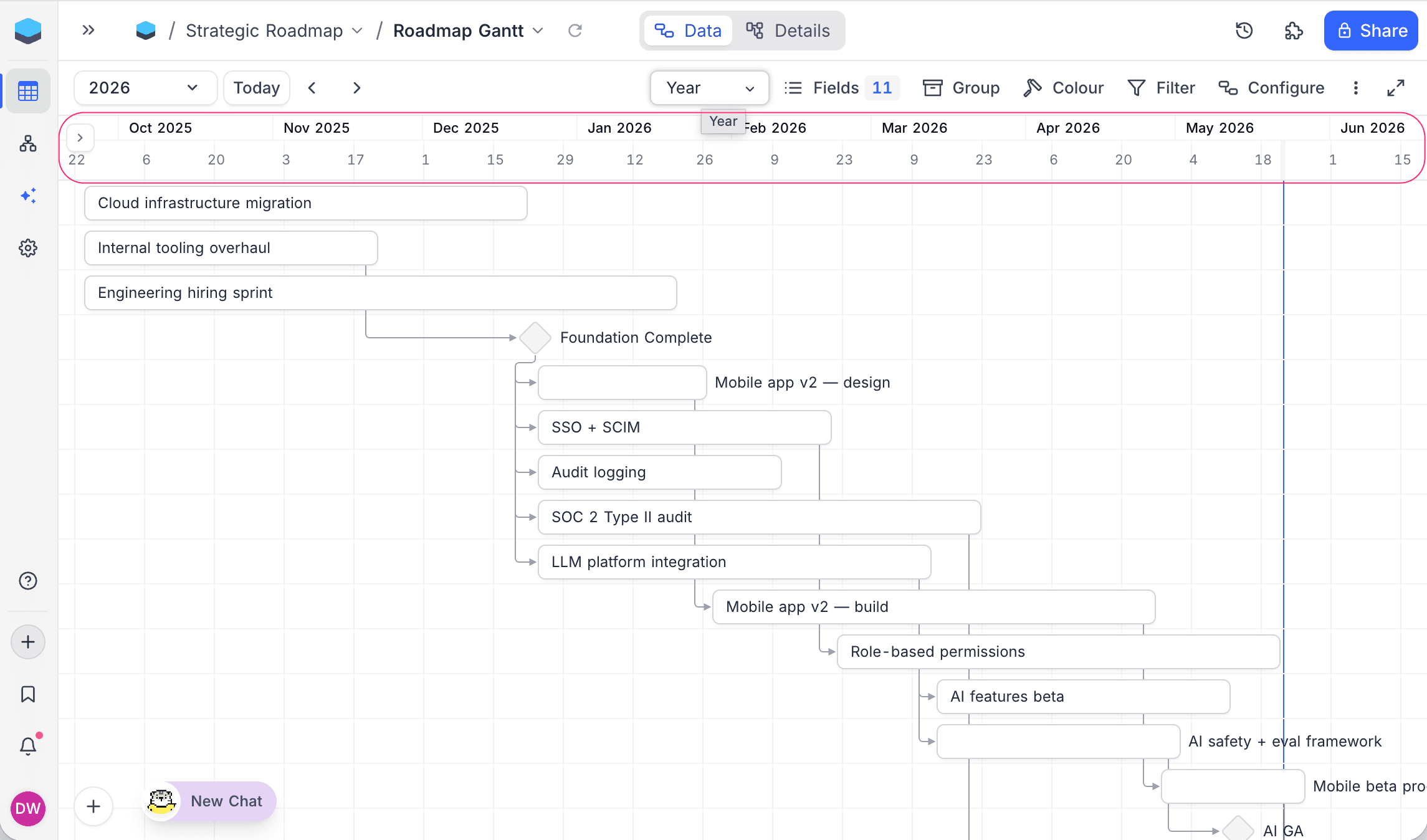
Gantt View supports eight zoom levels, from a one-week sprint view out to a five-year roadmap. Switch between them using the zoom selector in the toolbar.
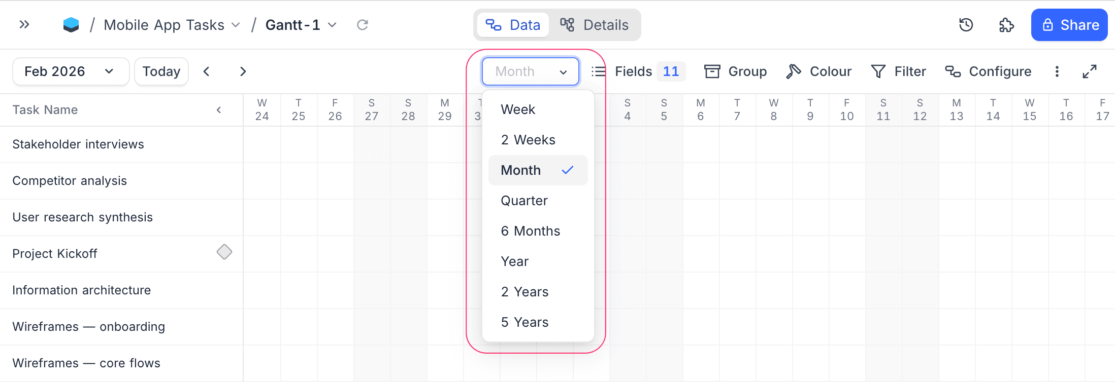
| Zoom | Span shown | Best for |
|---|---|---|
| Week | Seven days (Monday through Sunday) | Weekly planning, sprint views |
| 2 Weeks | Two weeks | Fortnightly sprints, short-cycle scheduling |
| Month | One calendar month | Monthly overview |
| Quarter | Three months | Quarter planning |
| 6 Months | Six months | Half-year roadmaps |
| Year | Twelve months | Annual planning |
| 2 Years | Two years | Multi-year projects |
| 5 Years | Five years | Long-range portfolio views |
At coarser zooms, the date header stacks multiple tiers, for example year over quarter over month, so you can keep your bearings while seeing a wider span at once.
Navigation
Time Navigation
- Use the Previous and Next buttons in the toolbar to navigate backward or forward by one step of the active zoom level.
- Click the Today button to jump to the current date.
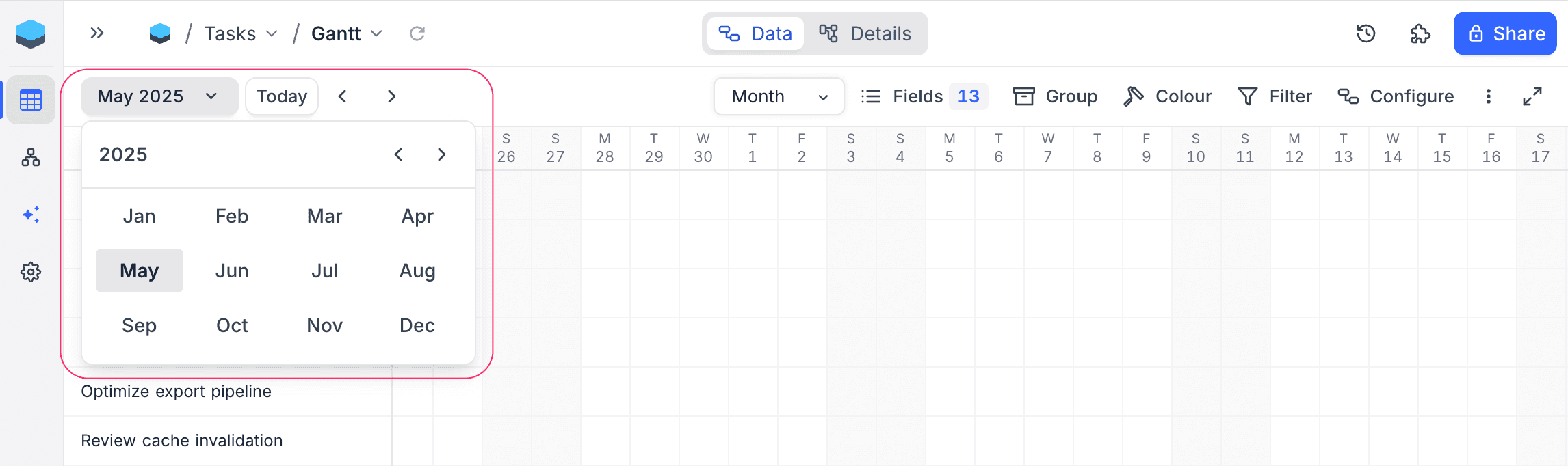
- Use the Date Picker dropdown to navigate directly to a specific date.
Scrolling
- Horizontal scrolling pans across time. Records load progressively as you scroll, so you can browse across months or years without having to jump to a specific date.
- Vertical scrolling is supported when the number of records exceeds the visible height. In grouped layout, each group scrolls within the groups list while the date header stays fixed at the top.
Record Navigation
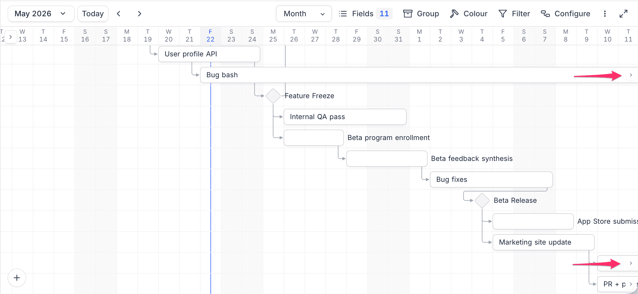
When a record bar extends beyond the visible area, navigation arrows appear on the bar:
- A left arrow appears when the record's start date is clipped (off-screen to the left).
- A right arrow appears when the record's end date is clipped (off-screen to the right).
Click on these arrows to navigate to the corresponding date.
Clicking a record in the left sidebar also pans the date axis when the bar is fully off-screen; if any part of the bar is visible, the timeline stays put so vertical scrolling does not disturb your horizontal position.
Record List Sidebar
The left sidebar lists every record currently in view. It is collapsible (click the chevron at the top of the sidebar) and resizable (drag its right edge). Width and collapsed state are persisted across sessions.
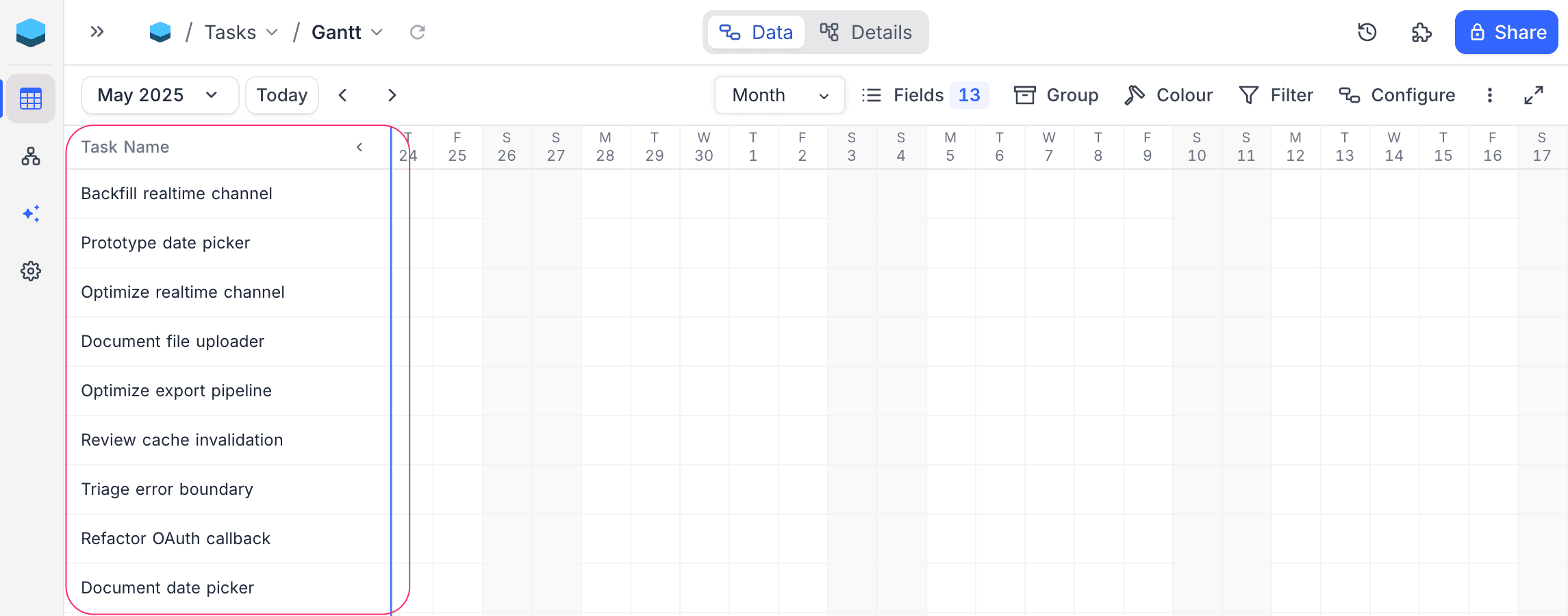
When collapsed, the sidebar shrinks to a slim "Show Sidebar" stub so the chart can use the full width.
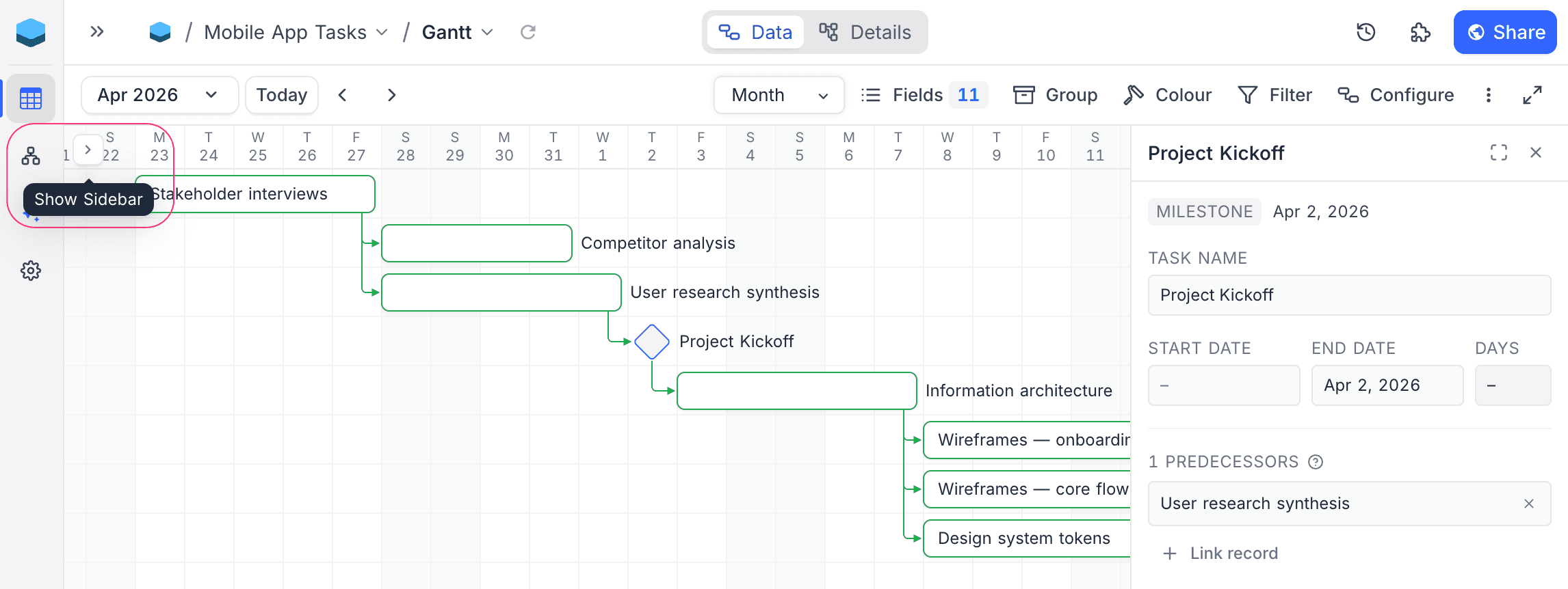
Click a record in the sidebar to open the Record Inspector for it.
Bars and Milestones
Task bars
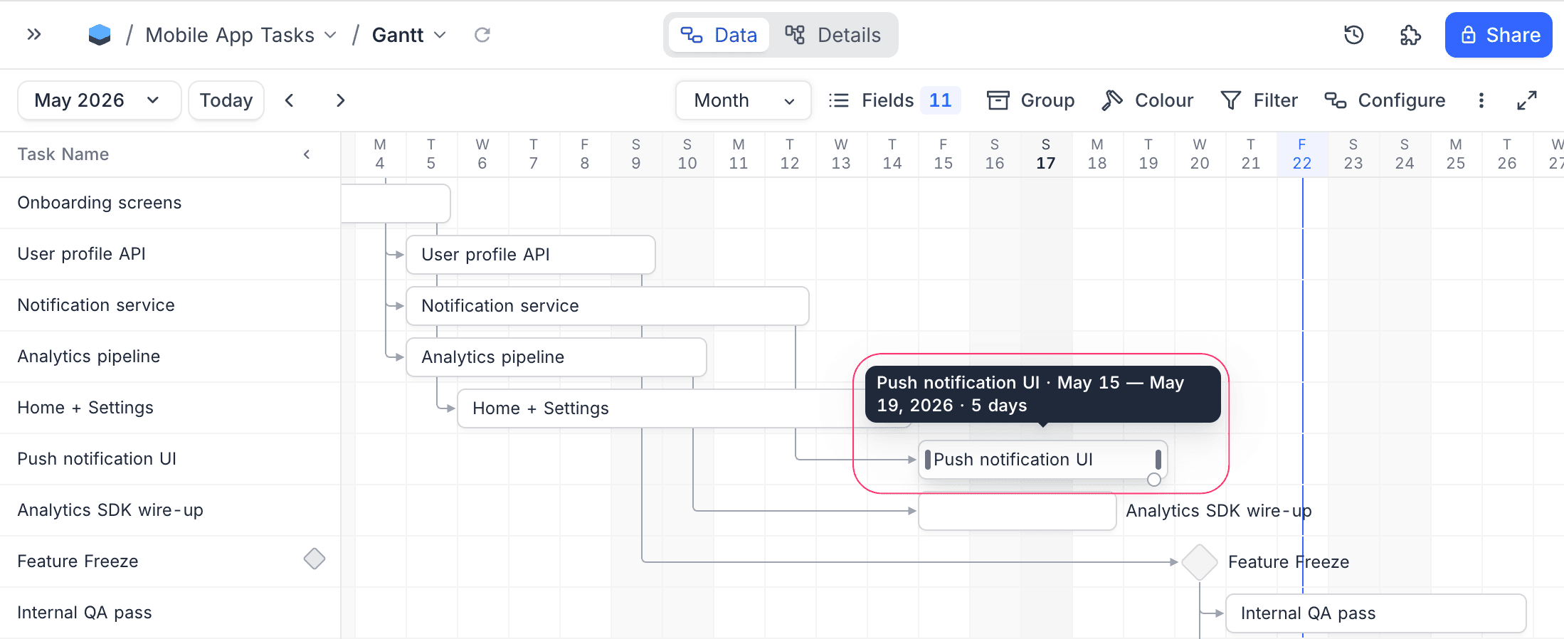
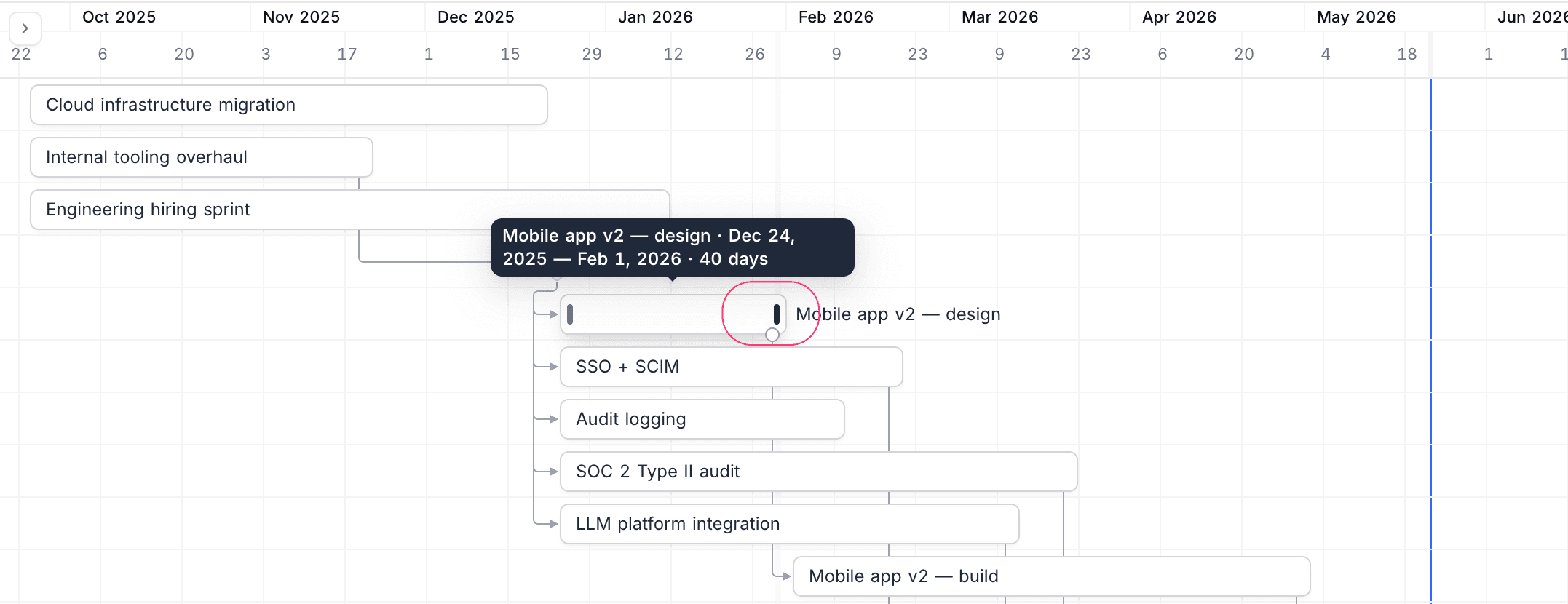
Records that have both a start date and an end date render as horizontal bars spanning from start to end. Hover a bar to see a tooltip with the record title, date range, and duration.
Milestones
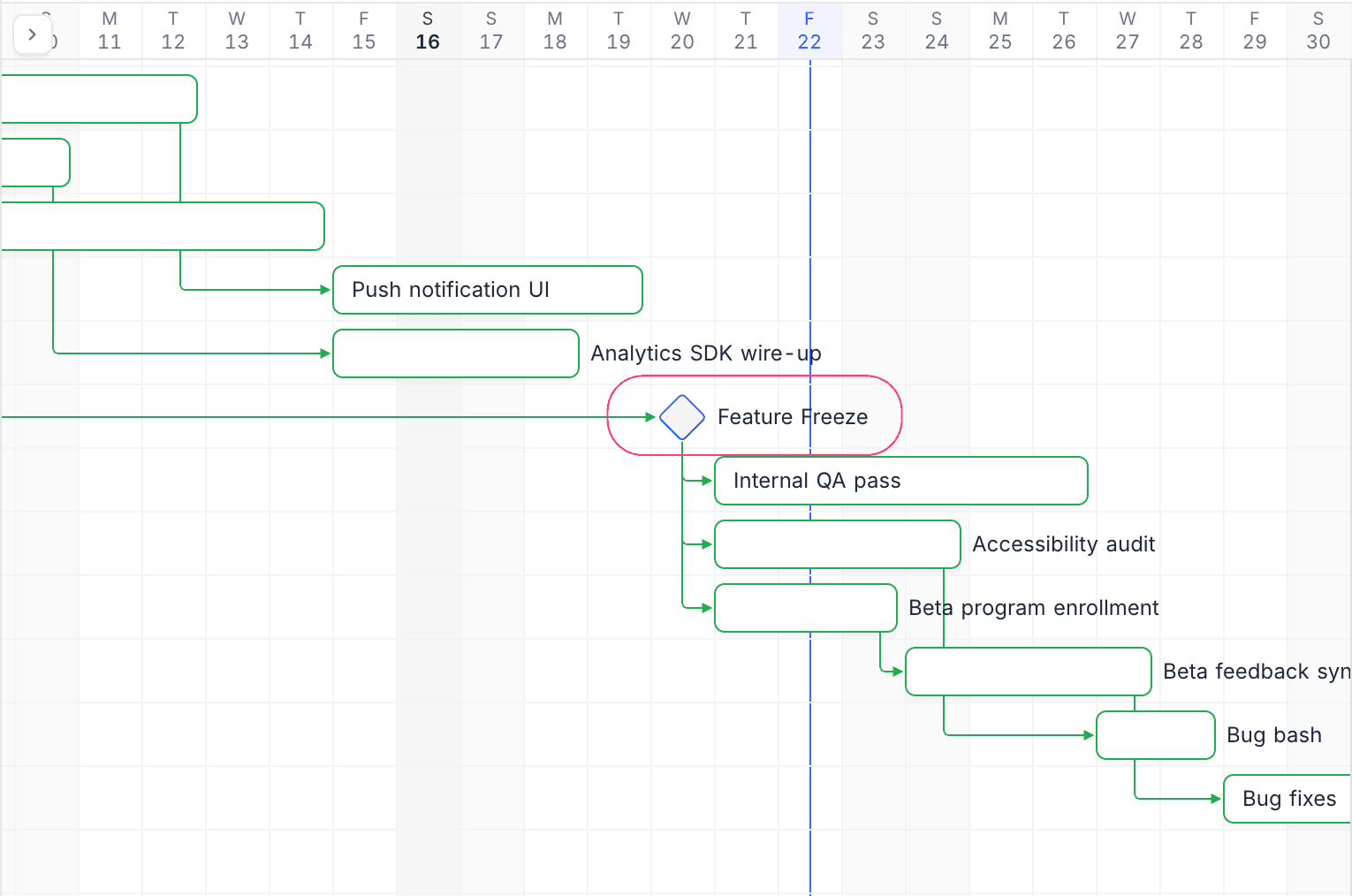
Records that have only an end date (start date empty) render as a diamond at the end-date column. Milestones still appear in the sidebar (with a small diamond marker on the right edge of the row so they are recognisable even when the bar is off-screen), can act as a predecessor or successor in a dependency chain, and can be dragged to a different date just like a bar.
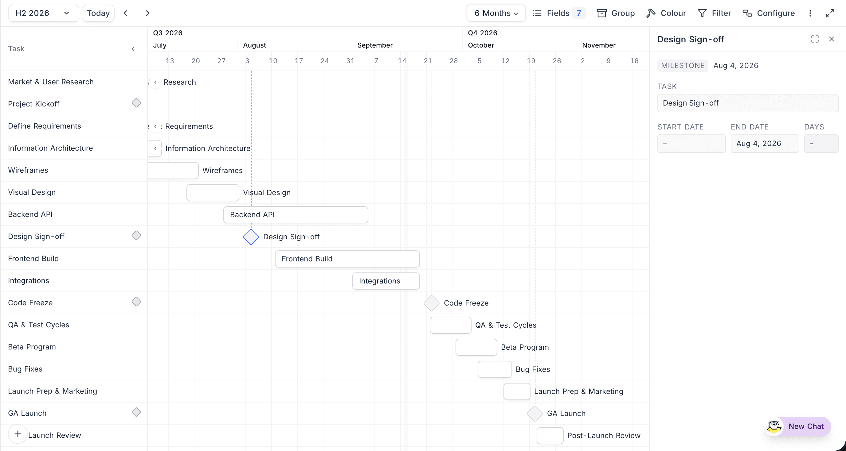
Each milestone also drops a subtle dashed vertical guide line from the date header down to the milestone diamond, similar to the "today" line, so you can read a milestone's date against the header at a glance.
In the example below, the selected Design Sign-off milestone shows its dashed guide line running up to the date header, with the record inspector confirming it as a milestone with only an end date:
Edit Record Dates
Drag to Move Click and hold a bar briefly, then drag it to a new date position. Both the start and end dates shift by the same number of days, preserving the record's duration. Milestones can be dragged to change their end date.
Drag to Resize Hover over the left or right edge of a bar to reveal a resize handle:
- Drag the left edge to change the start date.
- Drag the right edge to change the end date.
Dependencies
When a Successor Link field is configured, Gantt View draws arrows from each record to the tasks it points at (its successors).
Create a dependency
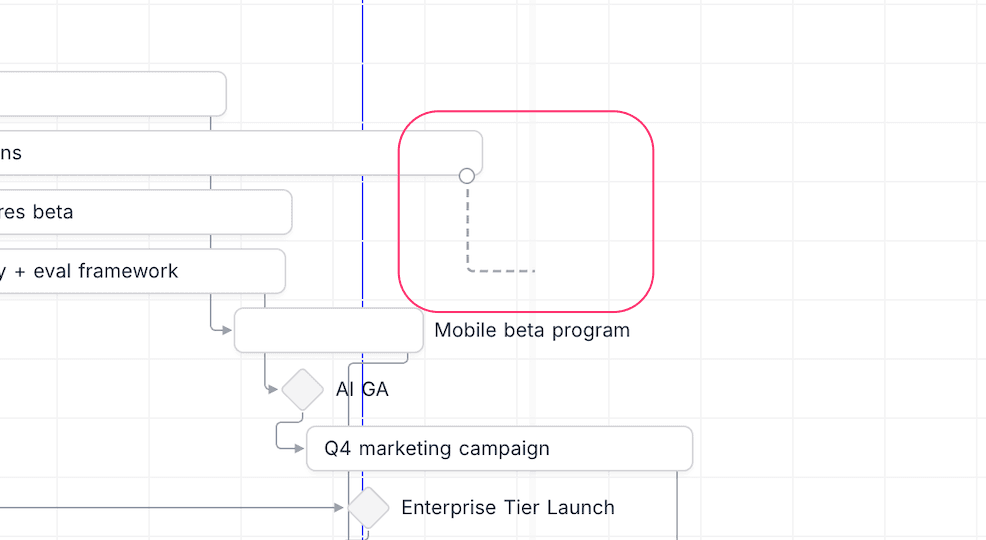
Hover over a bar to reveal a small circular dependency handle at the bottom-right corner (bottom tip for milestones). Click and drag from the handle onto another bar to create the link. The cursor draws an L-shaped preview while you drag.
Highlight the chain
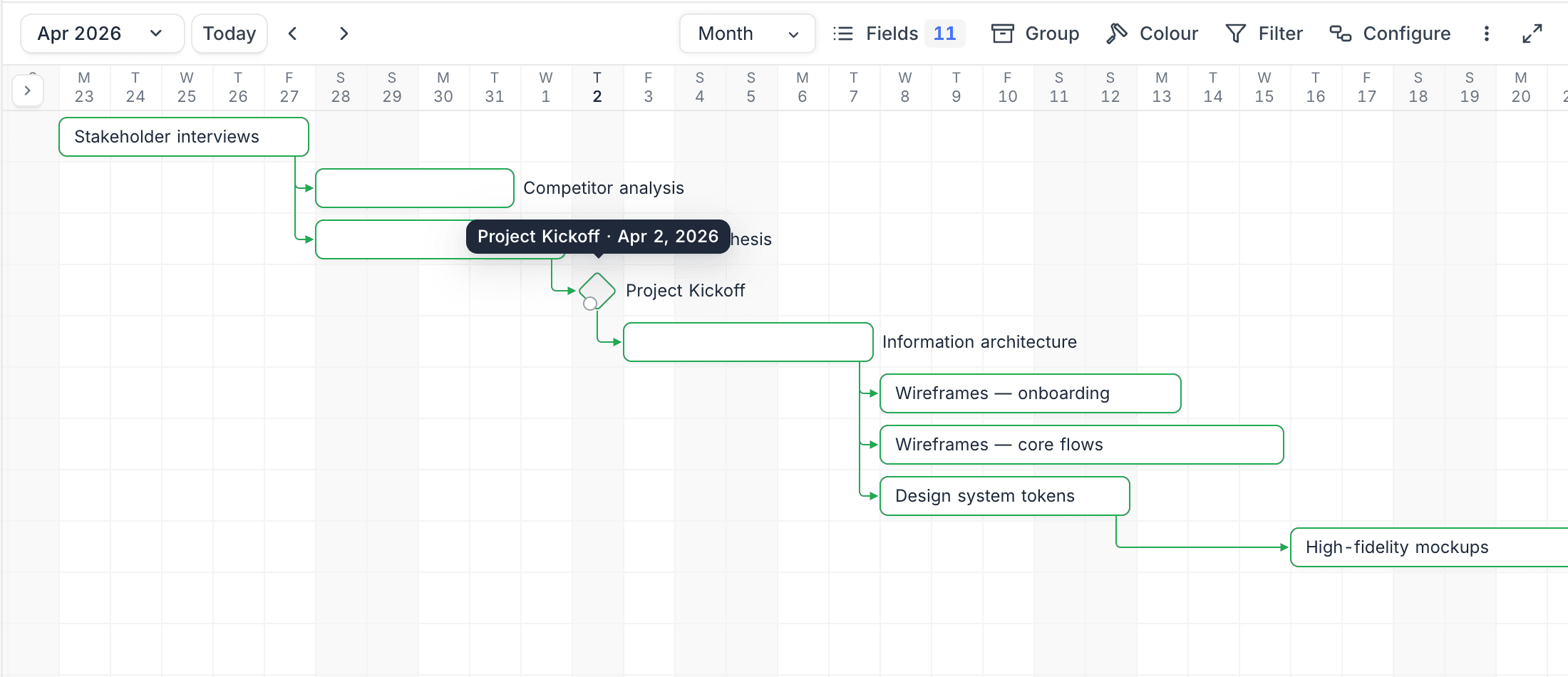
Hovering any bar or milestone outlines its entire connected dependency chain in green, both upstream and downstream. When the inspector is open, the inspected record's chain stays highlighted so you can keep your context while scrolling.
Remove a dependency
Click the dependency arrow to select it, then press Delete, or remove the link from the Record Inspector.
Record Inspector
Clicking a bar, milestone, or sidebar row opens the Record Inspector in a right-rail panel. The inspector lets you keep panning and zooming the chart while inspecting one record.
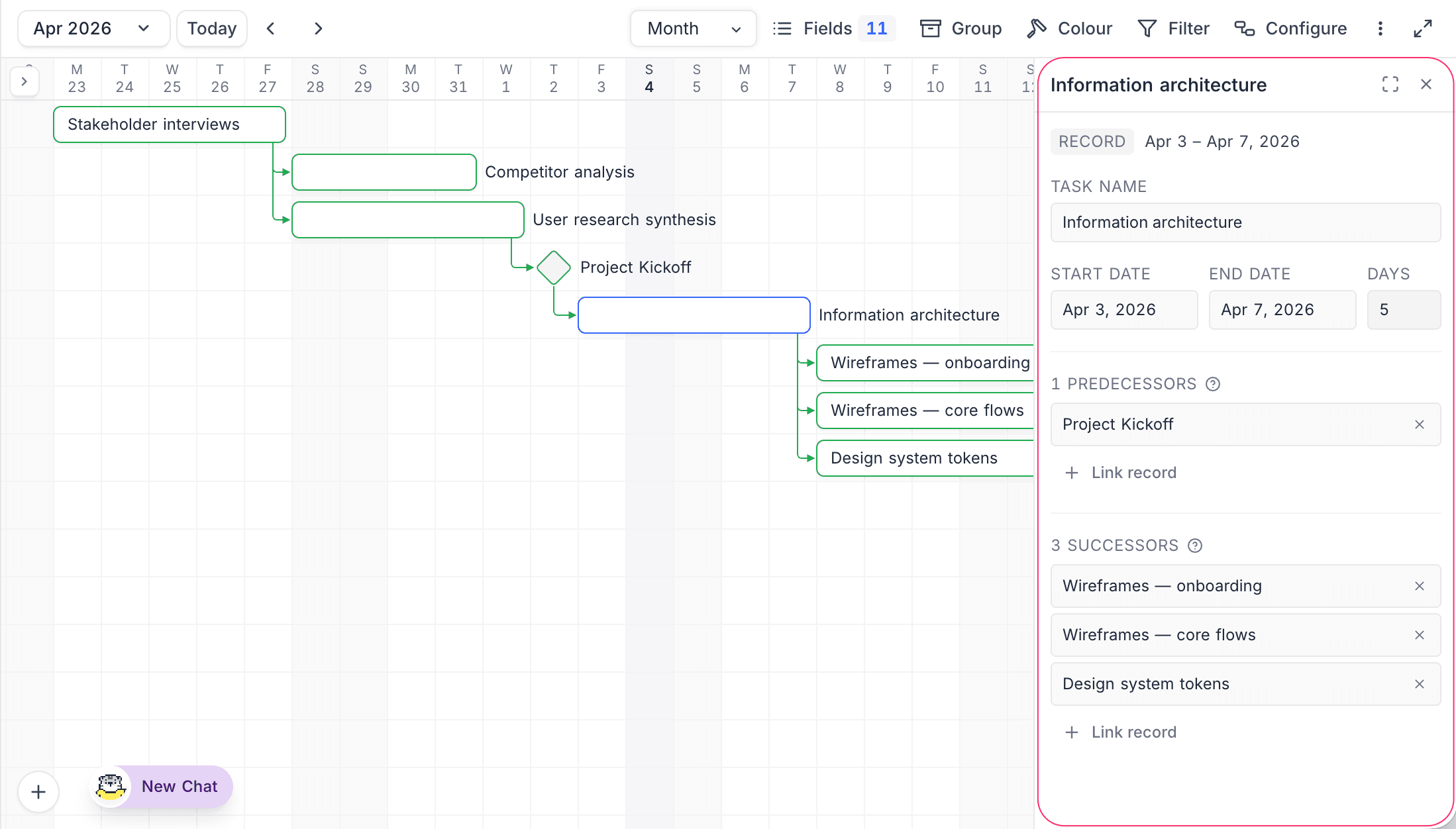
The inspector shows:
- A Record or Milestone badge and the date range.
- The primary field (record title), editable inline.
- Start Date, End Date, and Days (computed) fields. Click a date to open a picker.
- Predecessors section: every record that points to this one. Click
+ Link recordto add, click the×next to a chip to remove. - Successors section: every record this one points to. Same link / unlink controls.
Formula fields whose output is a URL render as clickable links in the inspector.
Click the Expand icon in the inspector header to open the full expanded record form for the same record. Press Esc to close any open picker first, then the inspector itself.
A second click on the same bar (the one already showing in the inspector) escalates straight to the full expanded form, matching the two-tier reveal pattern in other views.
Add New Records
There are two ways to add records in Gantt View:
Using the Add Button
Click the floating + button at the bottom-left of the chart. A new record is created with the start and end dates set to the currently visible date range, and the expanded record form opens.
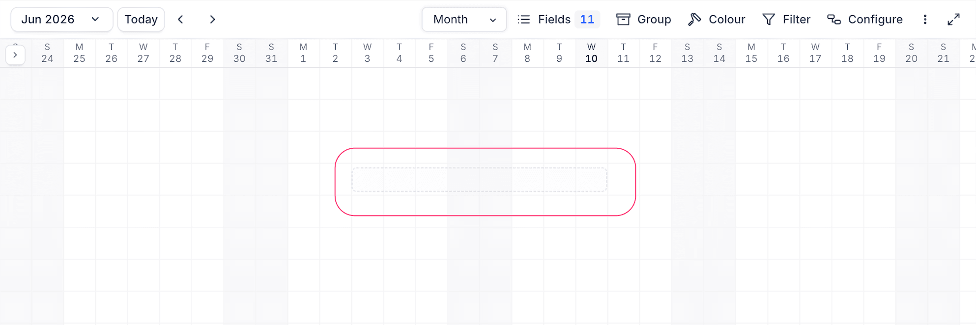
Drag to Create Click and drag on an empty area of the Gantt grid to create a new record:
- Click on the starting date and drag to the ending date.
- A dotted selection rectangle shows the date range being selected.
- Release to create the record. The expanded form opens with the start and end dates pre-filled.
Customize Record Label
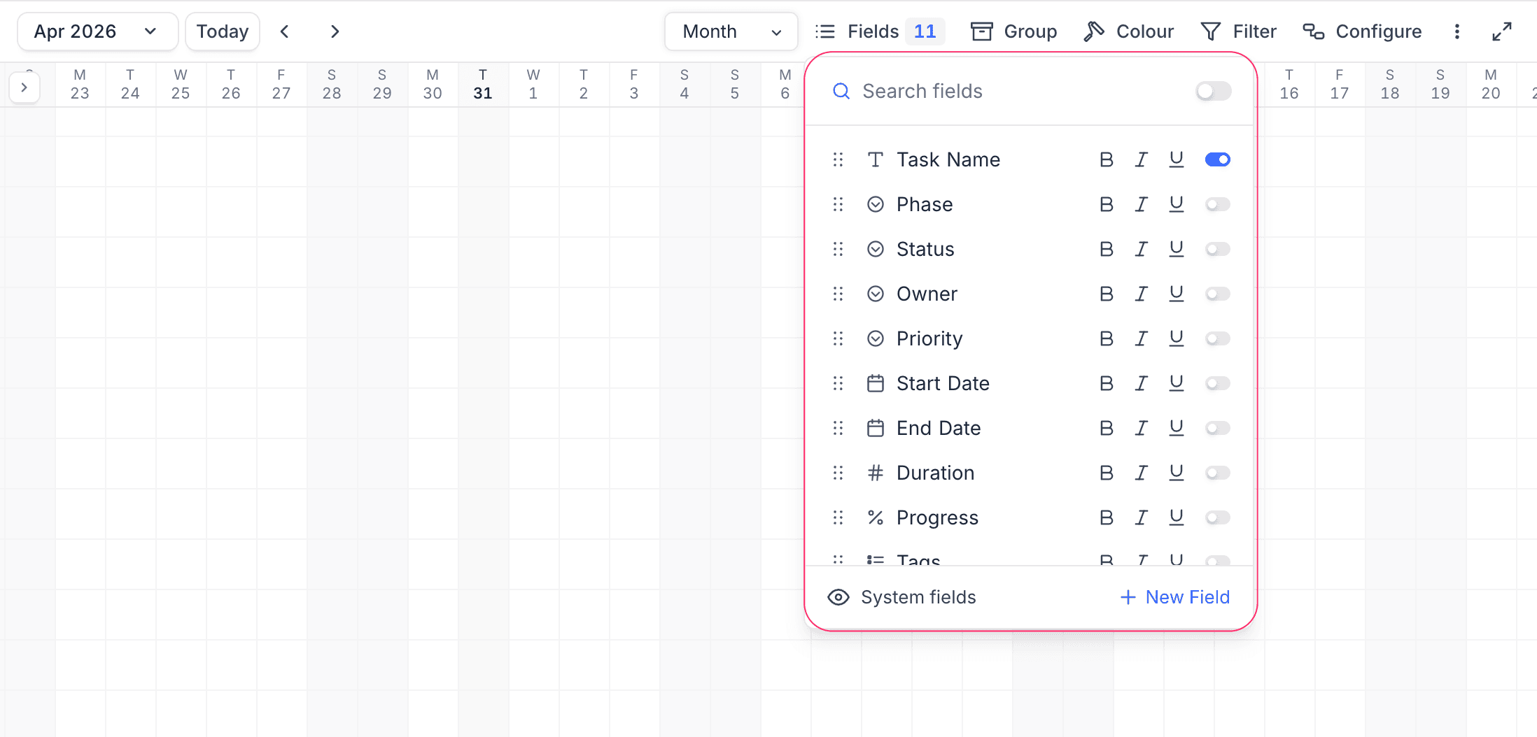
You can customize the fields displayed on record bars. Click the Fields menu in the toolbar:
- Toggle fields on or off to control which fields are shown on the bars.
- Reorder fields using drag and drop.
- Apply text formatting (Bold, Italic, Underline) to individual fields.
Grouping Records
You can group records by one or more fields using the Group By option in the toolbar. When grouping is active:
- Records are organized into collapsible groups in the left sidebar.
- Each group displays its own chart segment with a record count.
- The date header stays fixed at the top while groups scroll vertically.
- Dependency arrows that span groups are rendered above the groups list so chains stay visible across group boundaries.
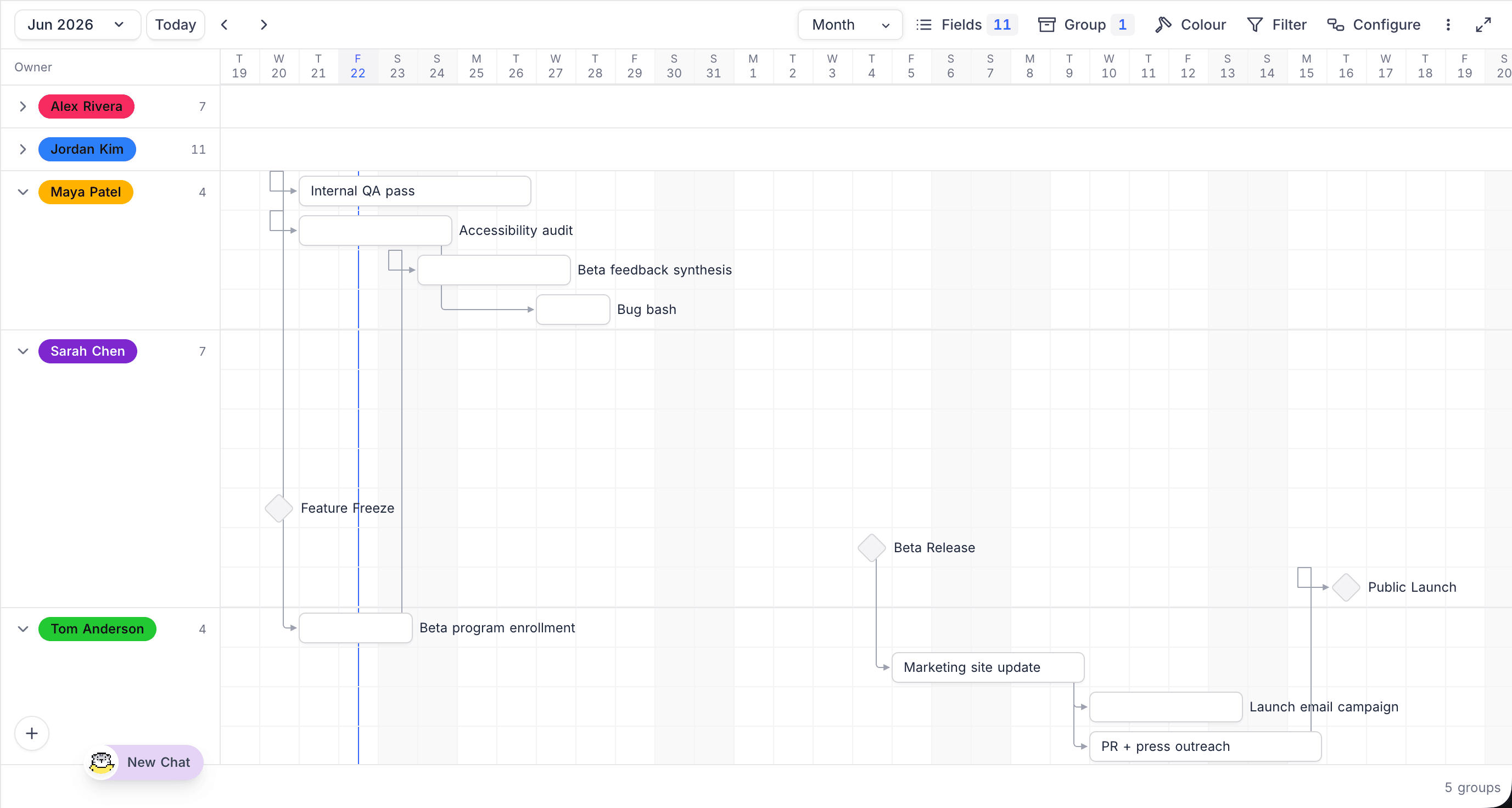
Each group-by entry in the Group By menu has an enable/disable toggle, so you can switch a grouping off and back on without losing its configuration.
Visual Indicators
- Today's date: Highlighted with a distinct background colour and blue text.
- Weekends: Displayed with a light grey background.
- Record colours: When Row Coloring is configured, the colour applies to the bar as a background fill, a left-edge accent stripe, or both, depending on the rule.
- Hover: Hovering a bar shows a tooltip with the record title, date range, and duration. Hovering also highlights the bar's entire dependency chain.
- Inspected record: The bar (or milestone) currently shown in the Record Inspector is outlined in the brand colour.
Shared and Public Views
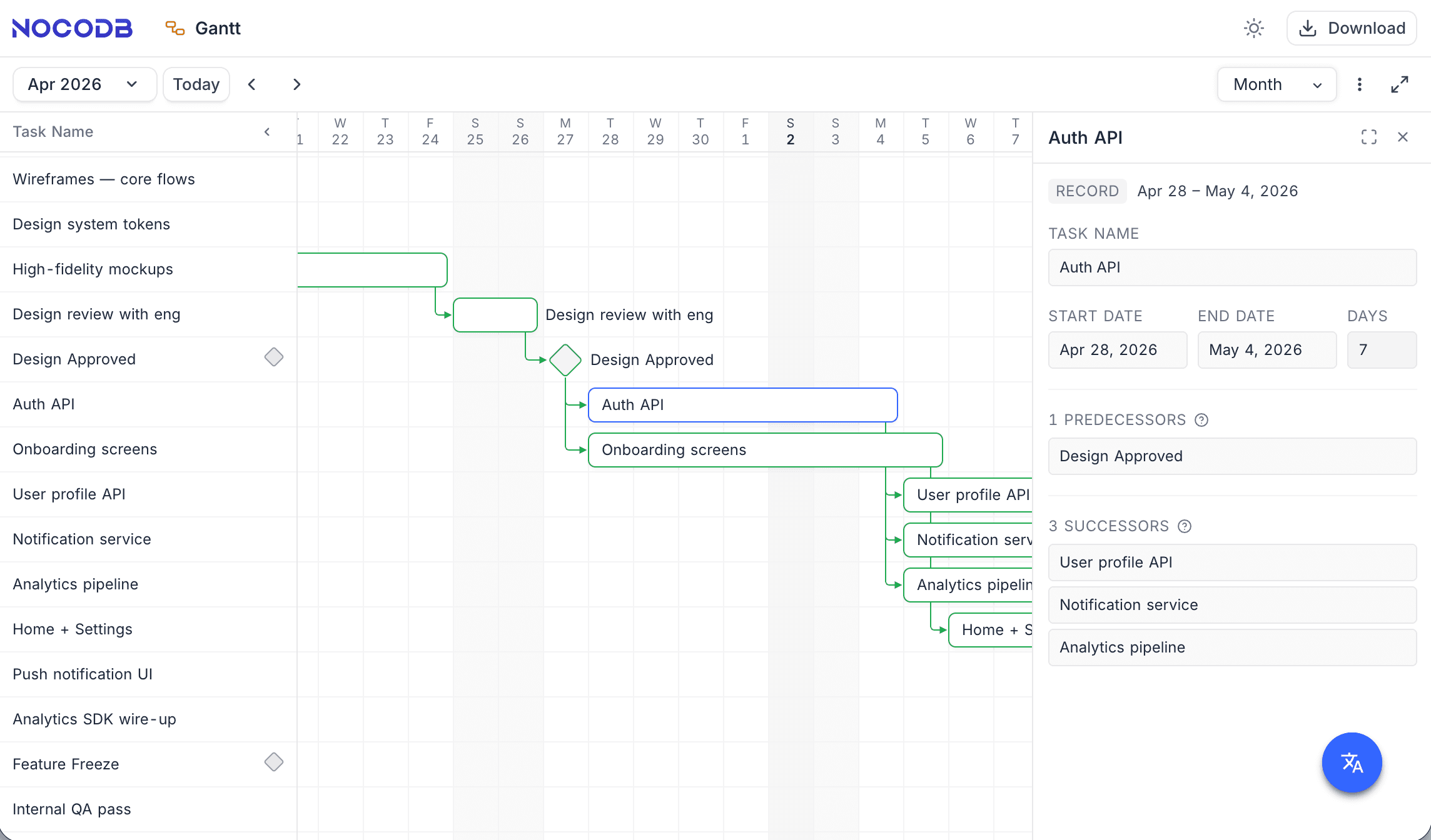
Gantt views can be shared via the standard Share View flow. In a public / shared view:
- Bars, milestones, and dependency arrows render normally.
- The Record Inspector is read-only: name and date fields are not editable, and the Link record / Unlink controls are hidden.
- Bar drag, resize, and the dependency handle are disabled.
Other Toolbar Operations
- Apply Filters to Display Specific Records on the Gantt
- Perform Quick Searches for Specific Data Within Fields
- Export Data to CSV or Excel Format
- Apply Row Coloring Based on Field Values