# Pie Chart
> Part of the NocoDB documentation (Product docs > Dashboard > Widgets). Index of all pages: https://nocodb.com/llms.txt. Any docs page is available as Markdown by adding `.md` to its URL.
URL: https://nocodb.com/docs/product/dashboards/widgets/pie-chart
Last updated: 2026-10-03
Configure a pie chart widget in a NocoDB dashboard to show how data is distributed.
Use the **Pie Chart** widget in NocoDB dashboards to show how data is distributed across categories. It is good for showing how segments make up a whole.
Add a pie chart of [tickets] by [Priority]
Add a pie chart of [records] by [Status]
Change the [widget name] chart to show only [open] records
## Title & Description
* **Title**: Enter a title for the pie chart widget. The title shows at the top of the widget.
* **Description**: Optional. Add a description that gives context or details about the data. The description shows below the title.
 ## Data Source
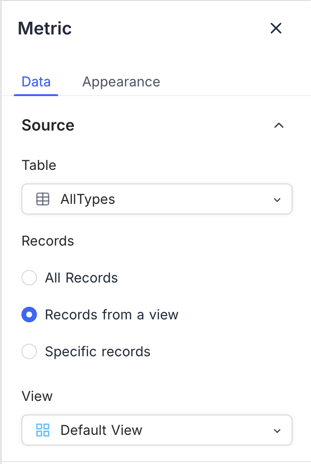
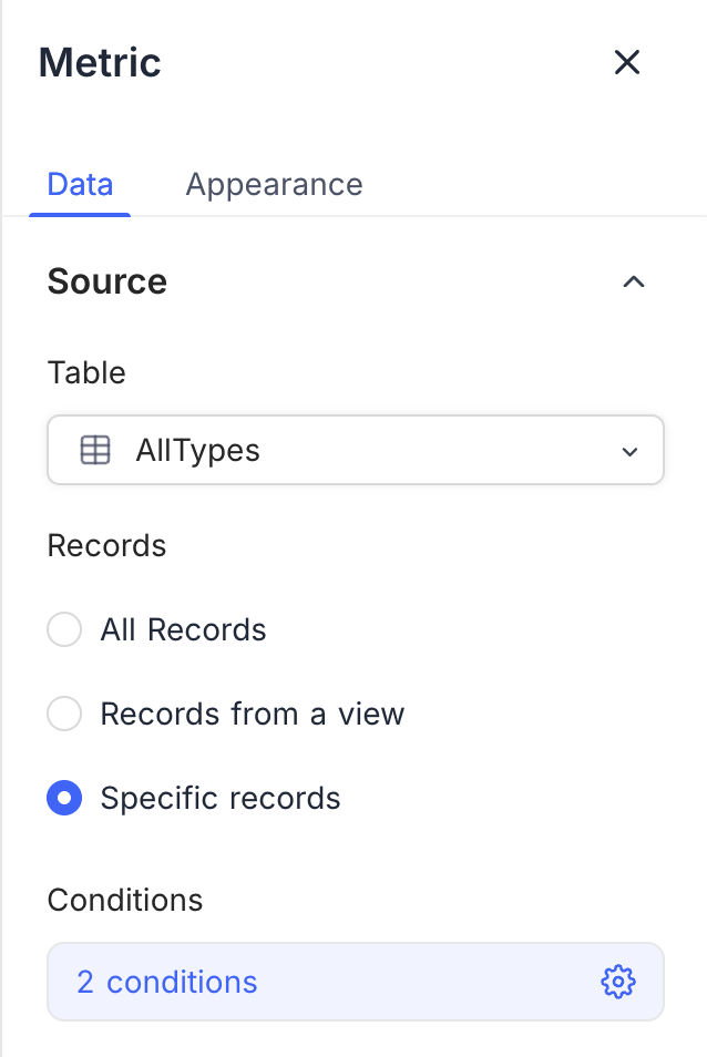
* **Table**: Select the table that supplies the data for the pie chart. This table is the main source of records for the chart.
* **Record**: Select the records from the table to include in the pie chart. The options are:
* **All Records**: Shows all records in the selected table.
* **Records from a view**: Filters the records with a specific view, for a more focused chart. Select a view from the list.
* **Specific Records**: Uses filters to select specific records for the pie chart. Use it to show data that meets some criteria. You can add more than one filter to narrow the selection.
## Display
* **Category Field**: Select the field that sets the segments of the pie chart. This field must contain the categories that you want to show.
* **Order**: Select the order of the segments in the pie chart:
* **Default**: Shows the segments in the order of the data.
* **Ascending**: Sorts the segments by value, in ascending order.
* **Descending**: Sorts the segments by value, in descending order.
* **Include empty records**: Optional. Includes records that have no value in the category field. Without this option, the chart can omit segments because of missing data.
* **Value Field**: Select the field that sets the size of each segment in the pie chart. This field must contain numbers that give the value for each category.
* **Record Count**: Shows the number of records in each category.
* **Field Summary**: Shows the sum, average, minimum, maximum, or count of a specific field across the selected records. The options change with the field type.
## Data Source
* **Table**: Select the table that supplies the data for the pie chart. This table is the main source of records for the chart.
* **Record**: Select the records from the table to include in the pie chart. The options are:
* **All Records**: Shows all records in the selected table.
* **Records from a view**: Filters the records with a specific view, for a more focused chart. Select a view from the list.
* **Specific Records**: Uses filters to select specific records for the pie chart. Use it to show data that meets some criteria. You can add more than one filter to narrow the selection.
## Display
* **Category Field**: Select the field that sets the segments of the pie chart. This field must contain the categories that you want to show.
* **Order**: Select the order of the segments in the pie chart:
* **Default**: Shows the segments in the order of the data.
* **Ascending**: Sorts the segments by value, in ascending order.
* **Descending**: Sorts the segments by value, in descending order.
* **Include empty records**: Optional. Includes records that have no value in the category field. Without this option, the chart can omit segments because of missing data.
* **Value Field**: Select the field that sets the size of each segment in the pie chart. This field must contain numbers that give the value for each category.
* **Record Count**: Shows the number of records in each category.
* **Field Summary**: Shows the sum, average, minimum, maximum, or count of a specific field across the selected records. The options change with the field type.
 ## Appearance
You can change the look of the pie chart to make it clearer. These options are available:
* **Size**: Set the size of the pie chart to fit your dashboard layout. Select small or medium.
* **Legend Orientation**: Select the position of the legend. The legend shows the category names and their colors.
| Option | Legend position |
| ---------- | ----------------------------- |
| **Right** | To the right of the pie chart |
| **Bottom** | Below the pie chart |
| **Left** | To the left of the pie chart |
| **Top** | Above the pie chart |
* **Show Percentage in chart**: Shows the percentage of each segment in the pie chart. This helps you understand the data distribution.
* **Show Count in Legend**: Shows the number of records for each category in the legend. This tells you how many records each segment has.
## Appearance
You can change the look of the pie chart to make it clearer. These options are available:
* **Size**: Set the size of the pie chart to fit your dashboard layout. Select small or medium.
* **Legend Orientation**: Select the position of the legend. The legend shows the category names and their colors.
| Option | Legend position |
| ---------- | ----------------------------- |
| **Right** | To the right of the pie chart |
| **Bottom** | Below the pie chart |
| **Left** | To the left of the pie chart |
| **Top** | Above the pie chart |
* **Show Percentage in chart**: Shows the percentage of each segment in the pie chart. This helps you understand the data distribution.
* **Show Count in Legend**: Shows the number of records for each category in the legend. This tells you how many records each segment has.
 ---
## Related pages
- [Number](https://nocodb.com/docs/product/dashboards/widgets/number.md): Configure a number widget to show key metrics in a NocoDB dashboard.
- [Text](https://nocodb.com/docs/product/dashboards/widgets/text.md): Configure a text widget to add static text to a NocoDB dashboard.
- [Bar Chart](https://nocodb.com/docs/product/dashboards/widgets/bar-chart.md): Configure a bar chart widget in a NocoDB dashboard to compare values across categories.
- [Line Chart](https://nocodb.com/docs/product/dashboards/widgets/line-chart.md): Configure a line chart widget in a NocoDB dashboard to show trends and comparisons over time or across categories.
- [Donut Chart](https://nocodb.com/docs/product/dashboards/widgets/donut-chart.md): Configure a donut chart widget in a NocoDB dashboard to show how data is distributed.
- [iFrame](https://nocodb.com/docs/product/dashboards/widgets/iframe.md): Use the iFrame widget to embed external web content securely in a NocoDB dashboard.
---
## Related pages
- [Number](https://nocodb.com/docs/product/dashboards/widgets/number.md): Configure a number widget to show key metrics in a NocoDB dashboard.
- [Text](https://nocodb.com/docs/product/dashboards/widgets/text.md): Configure a text widget to add static text to a NocoDB dashboard.
- [Bar Chart](https://nocodb.com/docs/product/dashboards/widgets/bar-chart.md): Configure a bar chart widget in a NocoDB dashboard to compare values across categories.
- [Line Chart](https://nocodb.com/docs/product/dashboards/widgets/line-chart.md): Configure a line chart widget in a NocoDB dashboard to show trends and comparisons over time or across categories.
- [Donut Chart](https://nocodb.com/docs/product/dashboards/widgets/donut-chart.md): Configure a donut chart widget in a NocoDB dashboard to show how data is distributed.
- [iFrame](https://nocodb.com/docs/product/dashboards/widgets/iframe.md): Use the iFrame widget to embed external web content securely in a NocoDB dashboard.